Design comparison
SolutionDesign
Community feedback
- @b16h22Posted 7 months ago
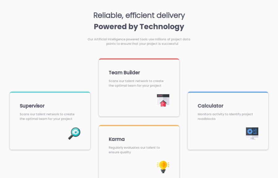
It is a good effort and a lot of elements came out very well. But it can be improved with little changes. The padding around the cards layout and title needs to be increased and the card background color can be changed to white. Good luck!
Marked as helpful1
Please log in to post a comment
Log in with GitHubJoin our Discord community
Join thousands of Frontend Mentor community members taking the challenges, sharing resources, helping each other, and chatting about all things front-end!
Join our Discord
