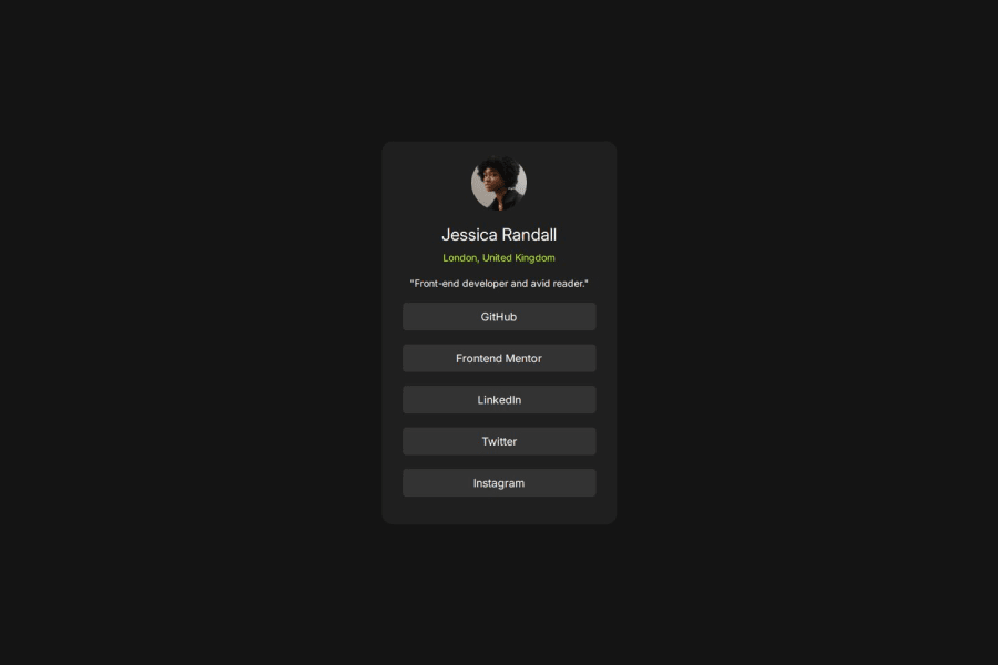
Design comparison
Community feedback
- @arpan62825Posted 7 months ago
Hey, fantastic effort on this! You’re really nailing it. Just a few things I noticed that could make it even better…
Using a
<main>tag inside the<body>of your HTML is a best practice because it clearly identifies the main content of your page. This helps with accessibility and improves how search engines understand your content. I would put the links into a<ul> <li>, I would reduce the use of<div>tags as it is bad from a SEO standpoint. Also it is a convention to put a '#' in the "href" if there is no link attached.<a href="#">Example</a><div class="card-links"> <a href="">GitHub</a> <a href="">Frontend Mentor</a> <a href="">LinkedIn</a> <a href="">Twitter</a> <a href="">Instagram</a> </div>For future project, You could downloading and host your own fonts using @font-face improves website performance by reducing external requests, provides more control over font usage, ensures consistency across browsers, enhances offline availability, and avoids potential issues if third-party font services become unavailable.
I hope you found this advice helpful! Keep up the great work, and don’t forget to dive deeper into the details. You’re doing amazing, and I can’t wait to see what you create next. Happy coding! 🚀
Marked as helpful0 - P@StroudyPosted 7 months ago
Awesome job tackling this challenge! You’re doing amazing, and I wanted to share a couple of suggestions that might help refine your approach…
-
Using a
<main>tag inside the<body>of your HTML is a best practice because it clearly identifies the main content of your page. This helps with accessibility and improves how search engines understand your content. -
Having a clear and descriptive
alttext for images is important because it helps people who use screen readers understand the content, making your site more accessible. It also improves SEO, as search engines usealttext to understand the image's context, helping your site rank better, Check this out Write helpful Alt Text to describe images, -
I would put these into a
<ul> <li>, and the text should be wrapped with a<a>so it is accessible with a keyboard using the tab key, Using an<a>tag for navigation is semantically correct, improves accessibility for screen readers, and ensures consistent behavior across browsers, unlike a<button>or a<div>not intended for links.
<div class="card-links"> <a href="">GitHub</a> <a href="">Frontend Mentor</a> <a href="">LinkedIn</a> <a href="">Twitter</a> <a href="">Instagram</a> </div>-
Using
remoremunits in@mediaqueries is better thanpxbecause they are relative units that adapt to user settings, like their preferred font size. This makes your design more responsive and accessible, ensuring it looks good on different devices and respects user preferences. -
For future project, You could downloading and host your own fonts using
@font-faceimproves website performance by reducing external requests, provides more control over font usage, ensures consistency across browsers, enhances offline availability, and avoids potential issues if third-party font services become unavailable. Place to get .woff2 fonts -
I think you can benefit from using a naming convention like BEM (Block, Element, Modifier) is beneficial because it makes your CSS more organized, readable, and easier to maintain. BEM helps you clearly understand the purpose of each class, avoid naming conflicts, and create reusable components, leading to a more scalable codebase. For more details BEM,
You’re doing fantastic! I hope these tips help you as you continue your coding journey. Stay curious and keep experimenting—every challenge is an opportunity to learn. Have fun, and keep coding with confidence! 🌟
Marked as helpful0 -
Please log in to post a comment
Log in with GitHubJoin our Discord community
Join thousands of Frontend Mentor community members taking the challenges, sharing resources, helping each other, and chatting about all things front-end!
Join our Discord
