Design comparison
Community feedback
- @ManshiporiyaPosted about 2 months ago
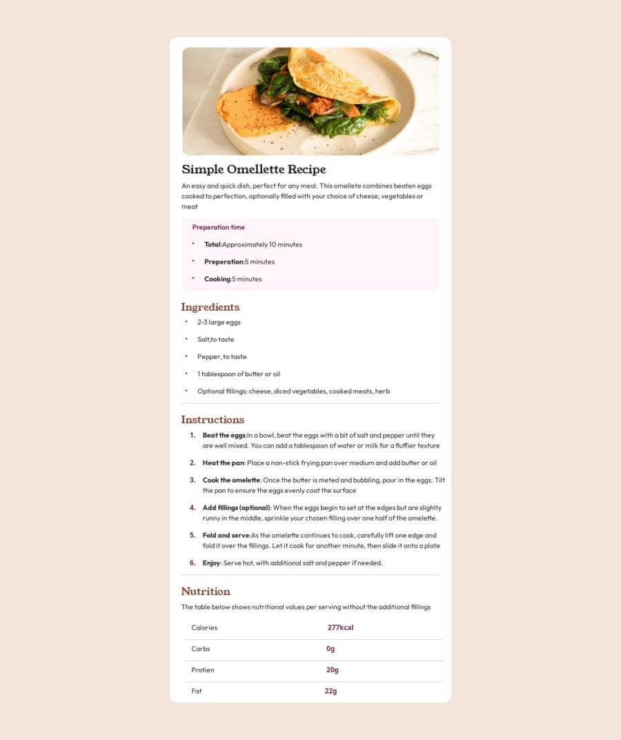
Semantic HTML: The code uses a mix of semantic and non-semantic elements, but could benefit from a bit more semantic structure:
The use of <main> is appropriate as it wraps the main content of the page. The h1 and h2 elements are semantically correct for headings, but the overall structure could benefit from more semantic HTML. Consider using a <section> for distinct sections like "Preparation Time", "Ingredients", and "Instructions". This helps clarify the page structure. For the list of ingredients and instructions, using <section> or <article> tags could provide better clarity and accessibility for screen readers. The <ul> for ingredients and the <ol> for instructions are good choices since these represent lists of items and ordered steps. 2. Accessibility: Some good practices are followed, but there are areas for improvement:
Alt text for images: The image alt text is descriptive, but could be more specific regarding its context. Instead of "open omelette on a white plate", something like "A well-cooked omelette with fresh vegetables served on a white plate" would give more context to users relying on screen readers. Color contrast: The description and nutritional information use lighter text (#555) on a light background, which might pose readability issues for users with visual impairments. It’s important to check the color contrast using tools like the WebAIM contrast checker. Headings and text hierarchy: The text hierarchy is generally good, but you should avoid skipping heading levels. For example, don't jump from h1 to h2 directly without considering the overall flow. Font size: The font size and the choice of 1rem/2rem units are good for scalability and should be readable across various screen sizes. You could also add larger font sizes or scaling for improved accessibility. 3. Responsiveness and Layout: The layout is overall clean and minimalistic but could benefit from more attention to responsiveness:
Mobile-friendliness: The container has a fixed width of 768px. This might look good on tablets or larger mobile screens, but on smaller devices, it might cause horizontal scrolling. Using a percentage width (e.g., max-width: 100%) or using a CSS grid/flexbox layout could improve responsiveness. Images: The image is set to 100% width, which works well for responsiveness. However, consider using the picture element with different image sources for different screen sizes (responsive images). Media Queries: Adding some media queries for small screens to adjust padding, text size, and image layout could enhance the user experience on mobile devices. For instance, the padding on .container can be reduced for smaller screens.
0
Please log in to post a comment
Log in with GitHubJoin our Discord community
Join thousands of Frontend Mentor community members taking the challenges, sharing resources, helping each other, and chatting about all things front-end!
Join our Discord
