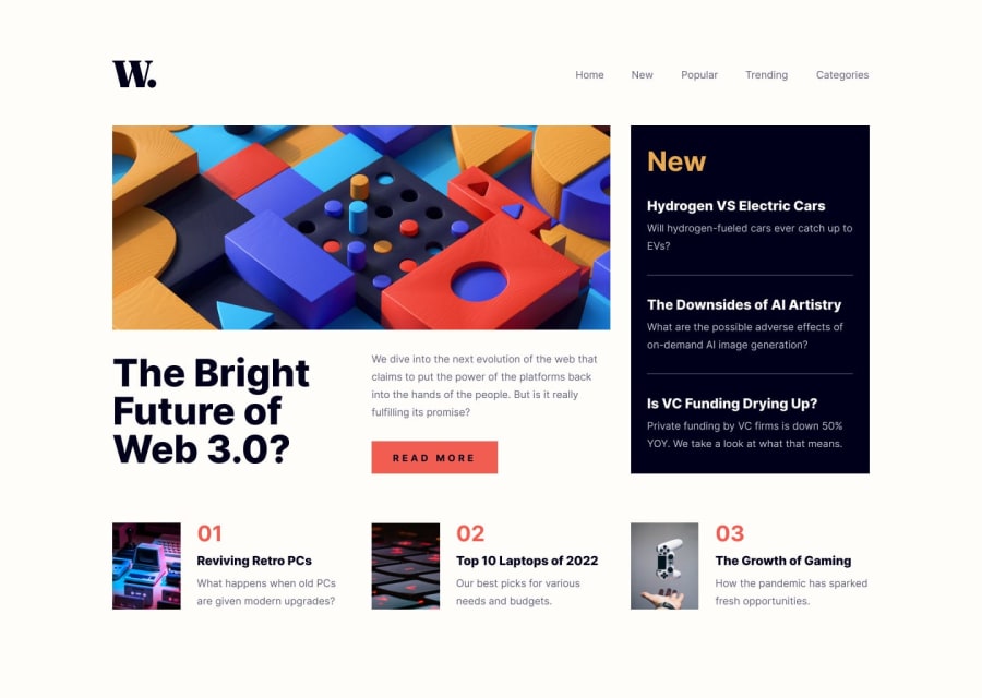
Design comparison
Community feedback
- @FrostemanNeogardPosted over 1 year ago
This looks quite good! I really like how the hamburger menu looks on the mobile view. There are some things that could be improved, though.
There seems to be some inconsistent padding around the header and the first
<section>element. You could either put padding on a container above all elements, or simply put padding on every direct child of<body>which can be done with a selector like this:body > *, though I wouldn't recommend this.There are also a couple hover effects that are missing, one of which being on the "trending" and "categories" buttons in the navbar. This seems to just be due to a missing
href="#"attribute on their anchor elements. There are also missing hover effects on the "Read more" button as well as the smaller articles.Another note is the HTML elements used. Your DOM structure looks like this:
body
    header
        nav
    section
        div
    footer
This works, though it could definitely be improved. I'd recommend doing something like this:
body
    header
        nav
    main
        section
            article
    footer
A wrapper around the entire thing would probably be quite good as well, but the most important thing is to have the
<main>element wrapping the most important content.Hope this helps!
Marked as helpful0
Please log in to post a comment
Log in with GitHubJoin our Discord community
Join thousands of Frontend Mentor community members taking the challenges, sharing resources, helping each other, and chatting about all things front-end!
Join our Discord
