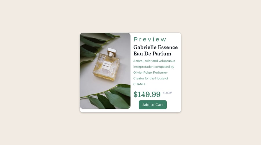
Responsive landing page using Bootstrap 5
Design comparison
Solution retrospective
I was unable to do responsive edges for images
Community feedback
- @correlucasPosted about 2 years ago
👾Hi @Prasadmuthyala, congratulations on your first solution!
I’ve few suggestions for you that you can consider adding to your code:
1.component and also the image using
border-radius: 15px- Add rounded borders to the left side of the image with
border-radius: 15px 0px 0px 15px; - Then do the same thing for the component but in the opposite borders
border-radius: 0px 15px 15px 0px;
2.The image is not responsive yet, a quick way to make any image responsive and respecting the container size is to add
display: blockandmax-width: 100%to the<img>selector. To improve the responsiveness even more adding the auto-crop property you can addobject-fit: coverto make the image crop inside the container its inside.img { display: block; object-fit: cover; max-width: 100%; }✌️ I hope this helps you and happy coding!
1 - Add rounded borders to the left side of the image with
Please log in to post a comment
Log in with GitHubJoin our Discord community
Join thousands of Frontend Mentor community members taking the challenges, sharing resources, helping each other, and chatting about all things front-end!
Join our Discord
