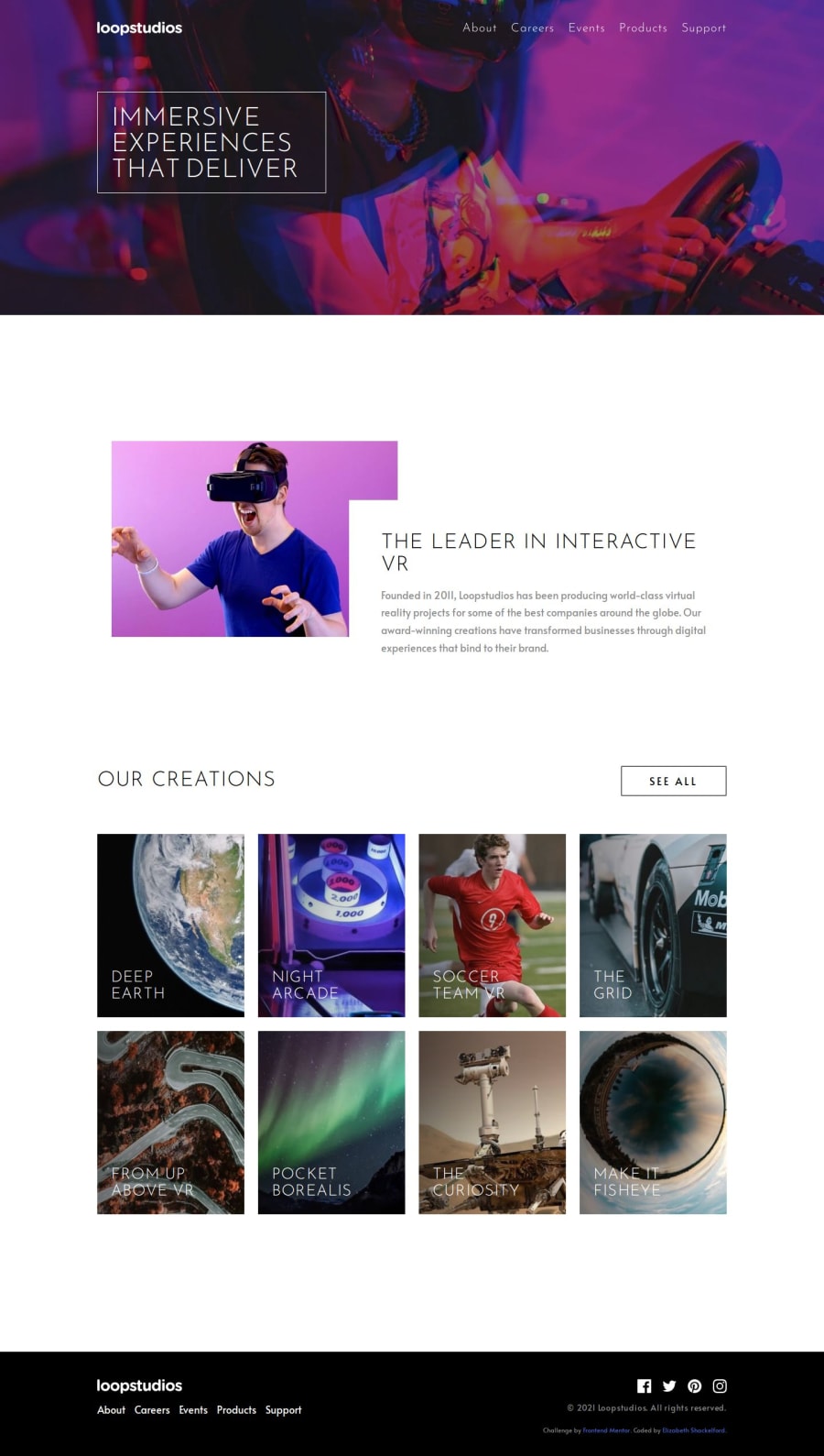
Responsive Landing Page Using BEM, HTML, Sass/SCSS, CSS Grid, and JS
Design comparison
Solution retrospective
I'm most proud of my progress in developing my front-end skills, learning about Sass/SCSS, and implementing SCSS file organization and parameterized mixins for more modular code. Using CSS Grid and figuring out how to create overlapping elements within a grid layout strengthened my responsive design skills, creating seamless transitions between mobile and desktop views. I was also proud to develop a responsive menu toggle that activates a sliding nav panel on mobile and, as an added extra feature, create a scroll-triggered nav effect for quick and easy access.
I enjoyed the iterative process of reviewing and editing my code. Each time I reviewed my work, I spent more time exploring front-end concepts, such as integrating Sass/SCSS, using semantic HTML, implementing CSS Grid, and applying responsive design techniques along with JavaScript.
In reflecting on how I can futher improve and expand my project, I want to learn how I can refine my file structure, improve my mixins and media query management, and expand my use of Sass/SCSS by exploring new concepts I haven't yet learned. I would also like to implement a light/dark theme using SCSS to create a more customizable and user-friendly experience, as well as learn how to optimize the performance of my responsive landing page.
What challenges did you encounter, and how did you overcome them?One of the main challenges I solved was using CSS Grid to build a responsive layout for seamless transitions between mobile, tablet, and desktop devices and create overlapping elements on tablet and desktop devices.
Another challenge emerged in integrating interactive logic with user-friendly design. To work through this challenge, I used JS to create a responsive menu toggle that enables a mobile user to access navigation through a sliding panel. I added an extra challenge of creating a scroll-triggered background change to the navigation, helping me further develop my skills in JS while tending to user experience and ensuring users can access the navigation from anywhere on the page.
I overcame challenges with CSS Grid layout changes, creating overlapping elements, and implementing JS for a responsive menu toggle, sliding nav panel, and scroll-triggered nav changes by breaking tasks into smaller steps, talking through my code, and using trial and error. As I worked on smaller parts, I began connecting the dots and seeing how pieces fit together, which allowed me to identify previous missteps.
What specific areas of your project would you like help with?-
How can I improve the structure of my SCSS files and my use of mixins to make my code more modular and easier to maintain?
-
How can I improve the clarity and logic of my JavaScript for the responsive menu toggle and scroll-triggered nav change?
-
Since this was a smaller project, I placed media queries under specific class selectors for better readability and to keep styles closely related to their elements. If this were a larger project, I would organize media queries by partials, consolidating all related class and mixin changes within each partial's media queries. Do you have any suggestions for optimizing media query organization?
Join our Discord community
Join thousands of Frontend Mentor community members taking the challenges, sharing resources, helping each other, and chatting about all things front-end!
Join our Discord
