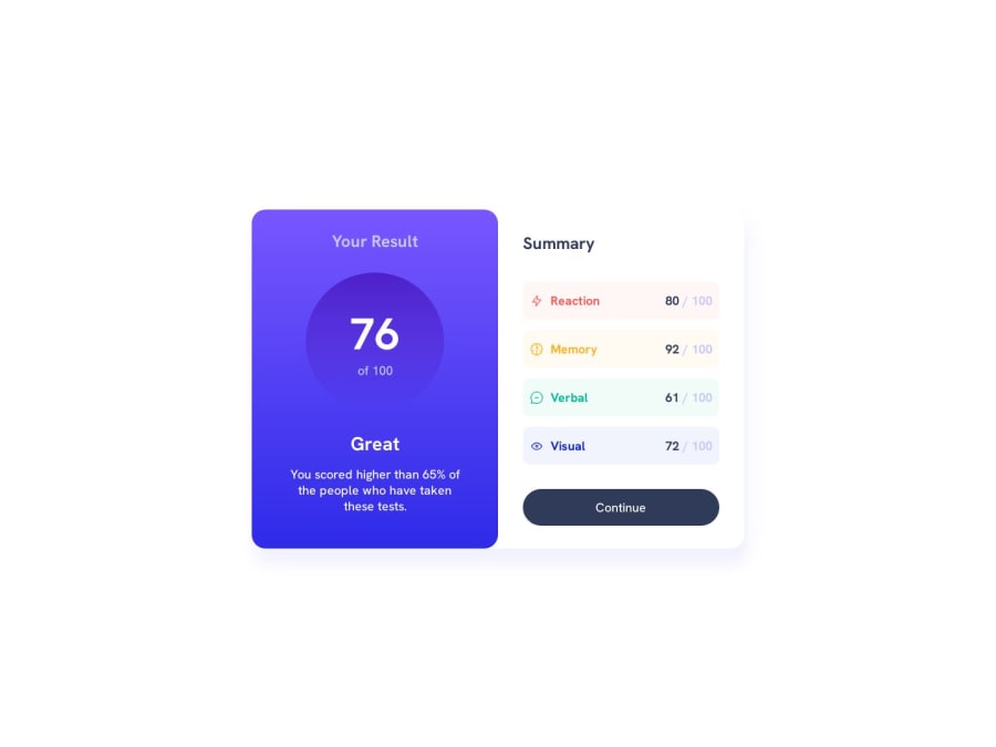
Design comparison
Community feedback
- @Islandstone89Posted 11 months ago
Hey, good work on the Summary Card. I'm not experienced in giving feedback on this challenge, but I wanted to give a few tips nonetheless - hope it helps :)
HTML:
-
I think "Your Result" and "Summary" should be some sort of headings.
-
The icons are decorative, so the alt text should be empty:
alt="".
CSS:
-
It's good practice to include a CSS Reset at the top.
-
Font-size must never be in px. Use rem instead.
-
Remove the
widthandmin-widthon.container. If needed, add amax-widthin rem. -
Remove the fixed width and height. You rarely want to set fixed dimensions, as this easily creates issues with responsiveness.
-
Media queries should be in rem instead of px. Ideally, you want to do mobile styling first and use media queries for larger screens. Anyway, your
max-widthis too low, I would change it to maybe around 40rem, which equals to over 600px.
Marked as helpful0 -
Please log in to post a comment
Log in with GitHubJoin our Discord community
Join thousands of Frontend Mentor community members taking the challenges, sharing resources, helping each other, and chatting about all things front-end!
Join our Discord
