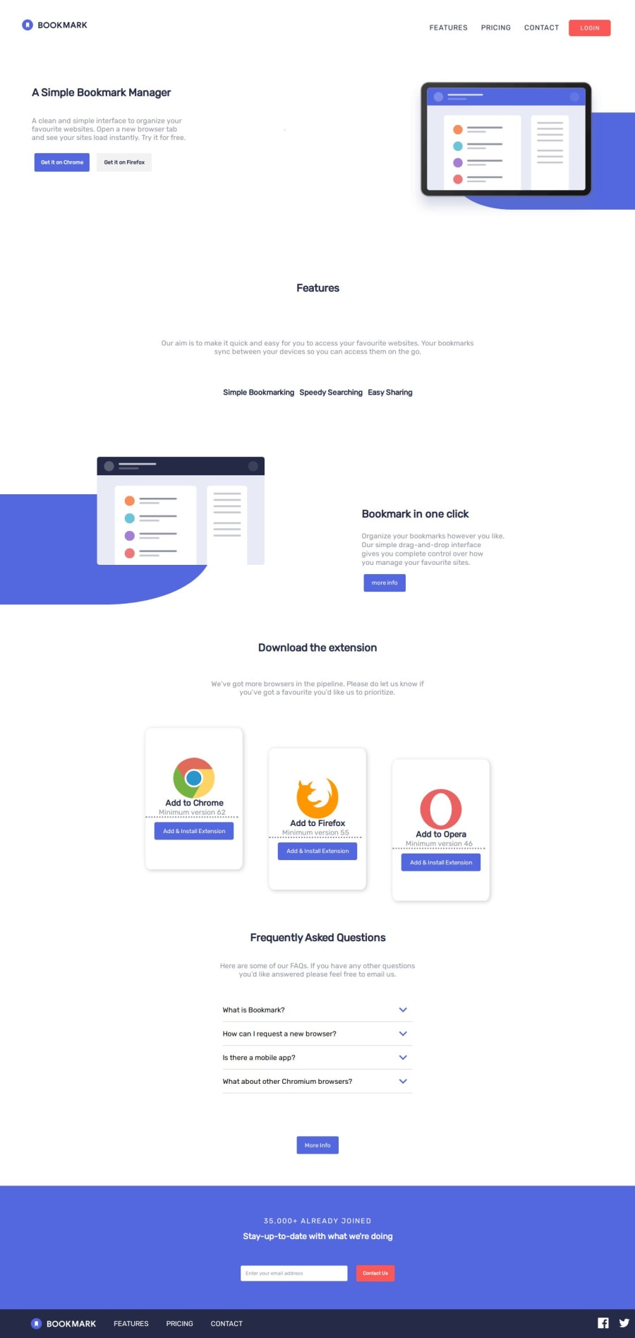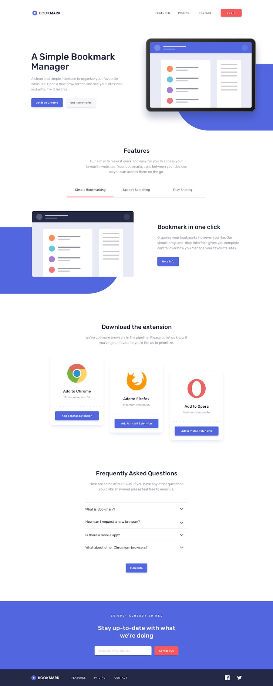
Design comparison
SolutionDesign
Solution retrospective
layout is not one of my favorite things to get to work, but animations are really cool to learn, though the animations i made for this aren't such a big thing, it's far more than what i expected to do in this project so i think i did it right. there's still a thing i would have loved to do and it was animating the arrows in the faq section to spin up and down as you click the container and not look like they just re-apear on a different position.
Community feedback
Please log in to post a comment
Log in with GitHubJoin our Discord community
Join thousands of Frontend Mentor community members taking the challenges, sharing resources, helping each other, and chatting about all things front-end!
Join our Discord
