Design comparison
SolutionDesign
Solution retrospective
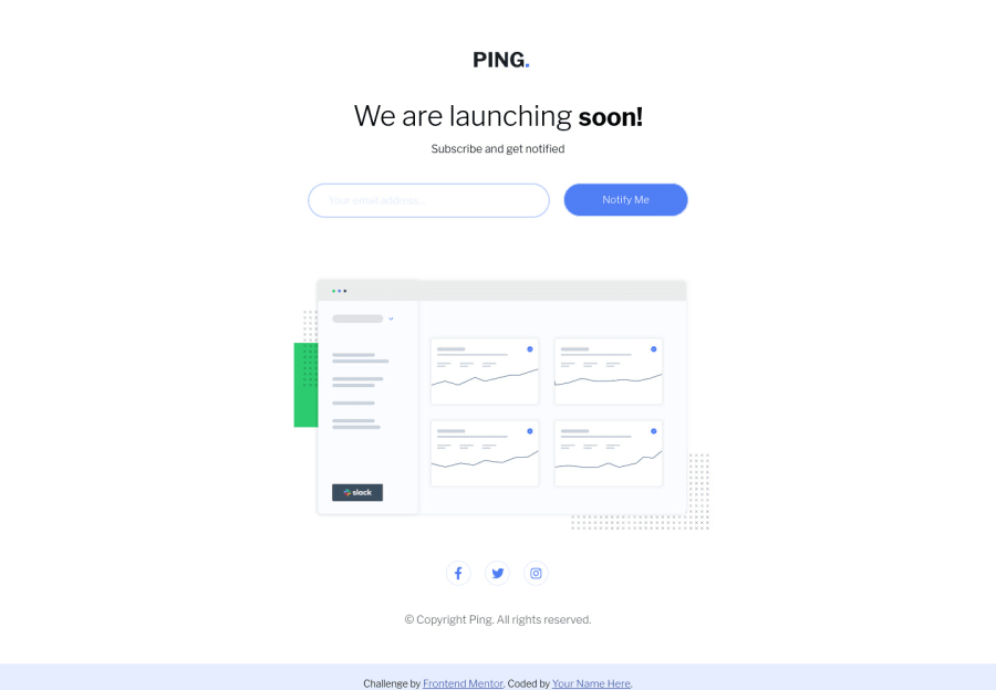
Finished! I think i could make the desktop layout just stretch to the mobile layout with margin: auto. But i decided to do like the mobile layout is like a "card", but i dont feel like it's good.
Community feedback
Please log in to post a comment
Log in with GitHubJoin our Discord community
Join thousands of Frontend Mentor community members taking the challenges, sharing resources, helping each other, and chatting about all things front-end!
Join our Discord
