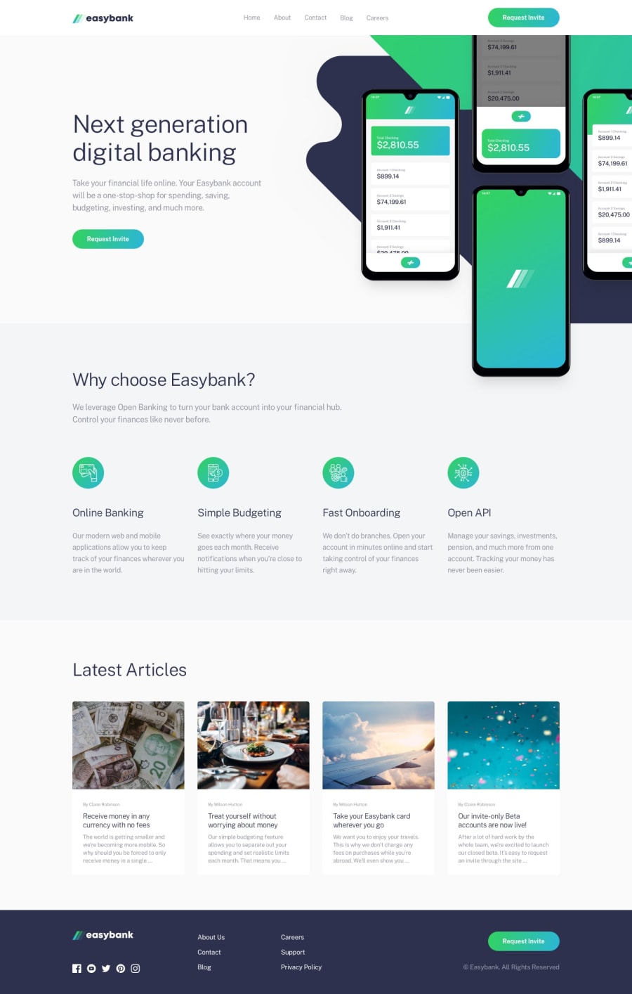
Design comparison
Solution retrospective
I am happy with how the page looked in the end, I think I managed to do alright with the responsiveness and it was tricky to make the SVG look decent enough on different screen sizes - Its not perfect but this was my first time working with SVGs that are large and take up a big portion of the screen. So I think I've learnt some stuff to handle them better next time.
I would definitely plan the layout more before jumping into the styling next time because I found I needed to add more divs for different screen sizes to get the different layouts, maybe thats normal to add to it but I think with more experience I can just know how and why certain elements need to be wrapped in a div or not.
What challenges did you encounter, and how did you overcome them?I encountered trouble with the SVG sizing and getting the styling correct. Overall I dont think it was too difficult and I overcame them by doing some research into SVGs and how they work.
What specific areas of your project would you like help with?I would really like to know how someone else with experience using TailwindCSS, React would approach the responsive design to this, how they would write up the markup and the different sections they would create components for.
This is my second web page using TailwindCSS so I definitely could improve how I use the utility classes.
Community feedback
Please log in to post a comment
Log in with GitHubJoin our Discord community
Join thousands of Frontend Mentor community members taking the challenges, sharing resources, helping each other, and chatting about all things front-end!
Join our Discord
