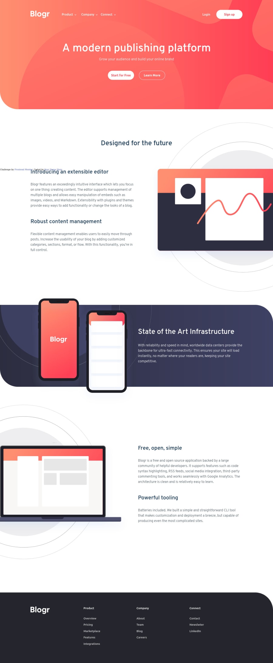
Responsive landing page. Semantic HTML, SCSS, Flebox and Javascript
Design comparison
Solution retrospective
Hello everyone!! This is my very first solution for frontendmentor, and in fact, the first page I code. Of course, I have build some little pieces of code, but never a whole structured page.
I would be very grateful for some feedback related to the order of the scss code, the html markups, and specially the structure from the header and navbar. It must be a better way to built the dropdowns behavior, and I'll improve that component in the near futur.
If you have some comment or advice, please let me know.
Thanks...
Community feedback
- @ApplePieGiraffePosted over 3 years ago
Hey, Atlas6174! 👋
Congratulations on completing your first Frontend Mentor challenge! 🎉 Good effort on this one! 👍 I like the smooth transition of the mobile menu! 😀
I'd like to suggest,
- Making the titles of the dropdown menus in the header navigation buttons instead of links so that clicking on them doesn't refresh the page and make the dropdown menu go away.
- Making sure the text content in the "Free, open, simple" section doesn't slide to the left of the page and end up covering the image on that side in the desktop layout.
Keep coding (and happy coding, too)! 😁
0@Atlas6174Posted over 3 years ago@ApplePieGiraffe Hi!! Thanks for the help!!
I'v fixed the issue with the navbar. The "a" tags were changed for "h2". I tried to make them buttons, but with h2 elements there are less needed styles to keep the layout from the page. But, it would be recommended to use buttons for this case?
And, related to the content in the third section, the issue was that I've write "justify-content: right" instead of "justify-content: flex-end" . That issue doesn't affect my browser, but I see that in some cases that property will be incorrect.
So, again, thanks!!
0 - @pikapikamartPosted over 3 years ago
Hey, there are some couple of issues the layout. Okay here are those that I encountered.
-
Your navbar, when I hover or click on the links, the dropdown seems do not appear and your browser reload. Then I look at the html, you used
atag in this one. I suggest you change this to other elements so that the dropdown will be seen if a user clicks on it. You canatags on navbar links, but, only if that link means going to another page right. But if you were to still use the tags in this one, what you could do is make the event listener for those navbar links to haveevent.preventDefault()in their respectiveaddEventListenermethods. -
The last section, the text is pushed on to the left side of the viewport. Instead of adding
justify-content: rightto your#third-section .section-bodyselector, addjustify-content: flex-end, this will make your elements be justified in the right side. I never usedrightorlefton that property, does it work?
Only that. The mobile layout seems pretty fine and that hamburger animation is pretty sick. Points for that ^^
0@Atlas6174Posted over 3 years ago@pikamart Hey!! Thanks for the feedback.
I've fixed the issue in the navbar (I change the a elements for h2 elements, and the page doesn't refresh). But, it may be useful make it an hover event. The problem here is that if the behavior from the dropdowns is both hover and click event, if the user click one dropdown and hover another, the dropdowns will overlap. In this case, is better make it only a hover event for desktop? Or try to make it both click and hover event and find the way to fix the overlap?
And related to the justify-content property, I see that the value "right" isn't used. It's extrange that in my browser it works. I've change that too, now the value is flex-end.
Again, thanks for the feedback
0@pikapikamartPosted over 3 years ago@Atlas6174 Well I suggest that you only made it hover only. Okay hovers works strange, in desktop right when a user hover, for example the dropdown, when I hover it will appear. Then when the website is in mobile state, of course I can't hover right, but if I click one of those, the dropdown will appear. It is like,
hoverpseudo element creates an effect both for desktop and mobile0 -
Please log in to post a comment
Log in with GitHubJoin our Discord community
Join thousands of Frontend Mentor community members taking the challenges, sharing resources, helping each other, and chatting about all things front-end!
Join our Discord
