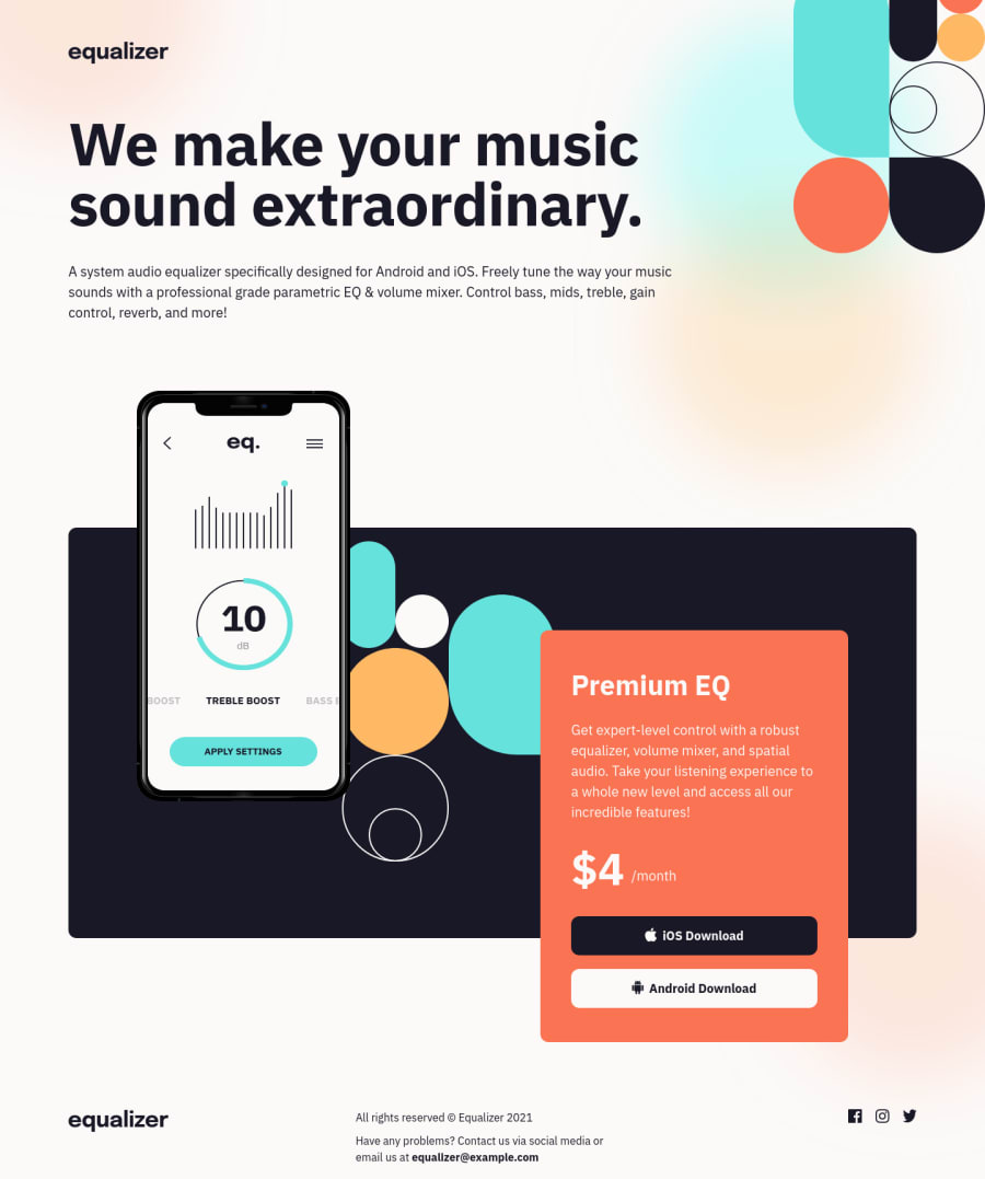
Responsive landing page using CSS Grid and Flexbox
Design comparison
Solution retrospective
This is attempt two of this challenge. I found this project particularly challenging, especially positioning the elements in the box section responsively. With the help of responsive CSS properties like clamp() and min(), I am quite satisfied with my solution now.
Feel free to leave suggestions or feedback. Happy to keep improving :)
Community feedback
- @j-hutchisonPosted almost 3 years ago
Great job! Had a look through this, and hope i can apply some of what you've done to my own solution! Your solution works great and scales well!
Couple of small things:
- hover states not added
- footer is commented out
Marked as helpful1@DCoder18Posted almost 3 years ago@j-hutchison Thank you so much for the feedback! I'm glad you've found something you can apply yourself :) I've corrected those points you've mentioned.
0
Please log in to post a comment
Log in with GitHubJoin our Discord community
Join thousands of Frontend Mentor community members taking the challenges, sharing resources, helping each other, and chatting about all things front-end!
Join our Discord
