

Design comparison
SolutionDesign

Community feedback
- @Mohit708Posted about 1 month ago
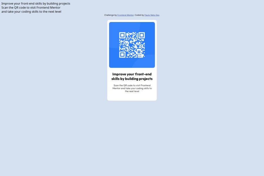
Text Placement: The top text should be part of the card, not floating above it.
Alignment: The card is too low; center it using flexbox or grid.
Spacing: Adjust line height for better readability.
Font Weight: Make the title bolder (font-weight: 700).
Extra Text: Remove unnecessary text at the top.
0

Please log in to post a comment
Log in with GitHubJoin our Discord community
Join thousands of Frontend Mentor community members taking the challenges, sharing resources, helping each other, and chatting about all things front-end!
Join our Discord