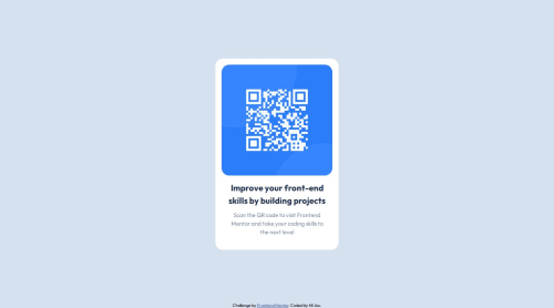
Submitted over 1 year agoA solution to the QR code component challenge
Responsive landing page
P
@MiJouHsieh

Solution retrospective
What are you most proud of, and what would you do differently next time?
- I take pride in revisiting the fundamentals of positioning, responsive web design (RWD), and media queries, as it has deepened my understanding after implementation.
- I utilized the
:rootproperty in CSS files to globally set colors. This served as a review exercise due to the simplicity of the project. - Next time, I plan to employ Sass syntax for CSS, leveraging its features to streamline and enhance my coding process.
There weren't significant difficulties, but I did have a momentary lapse in remembering which breakpoints to use within the media queries.
What specific areas of your project would you like help with?- Naming conventions for the markup and stylesheets.
- Streamlining CSS code for improved efficiency.
Code
Loading...
Please log in to post a comment
Log in with GitHubCommunity feedback
No feedback yet. Be the first to give feedback on MiJouHsieh's solution.
Join our Discord community
Join thousands of Frontend Mentor community members taking the challenges, sharing resources, helping each other, and chatting about all things front-end!
Join our Discord