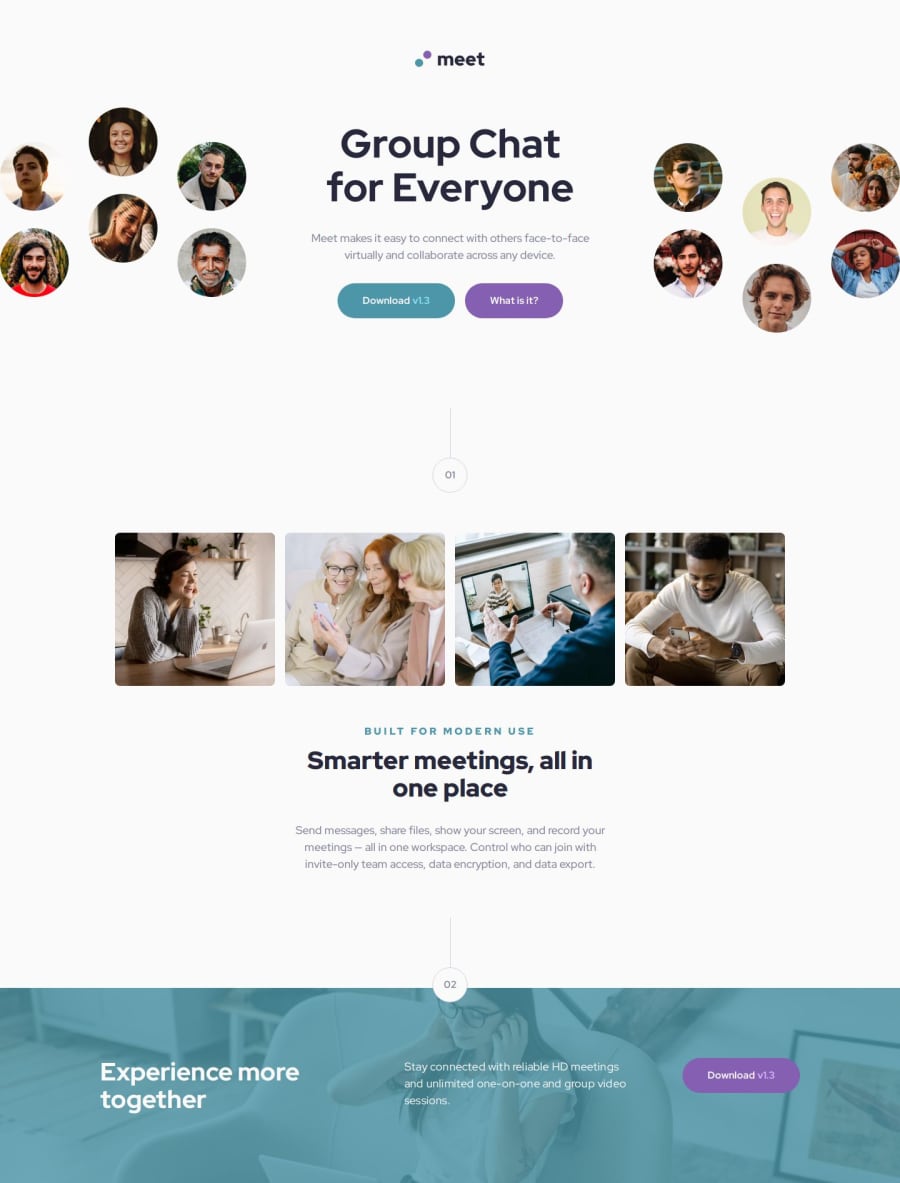
Responsive Landing Page | HTML, Sass, Flexbox & Media Queries


Design comparison

Solution retrospective
I’m proud of the clean, responsive design and well-structured Sass. Next time, I’d refine accessibility and optimize animations for a smoother experience.
What challenges did you encounter, and how did you overcome them?One challenge was aligning the button to the right in the footer. I fixed it by using margin-left: auto instead of justify-self, which only works in CSS Grid. Debugging layout issues with Flexbox helped me understand its behavior better. 🚀
What specific areas of your project would you like help with?Images are not exactly as the prototype but I believe the images provided are not the correct ones...
Community feedback
- P@schindlerdumagatPosted 23 days ago
Here are my feedbacks:
- I recommend that you use some CSS methodologies like BEM in styling your elements for better readability and code structure. But you can use other CSS methodologies as well if you want.
- For the logo, you can use img tag with alt attribute value of "meet" for better accessibility.
- I think using the article tag for the hero text content is not right since it doesn't stand out when this is moved to another page. And since it doesn't have an aria label, it is just like div. So, it is better to use div instead.
- It is better to import fonts in the HTML head element instead because HTML is the first resource the browser reads. Thus, it is faster to load.
- You can further breakdown you styles.scss by creating another scss partial file called _variables.scss or whatever you want to call it and just import it to your styles.scss for better readability and for separation of concerns. You can check the sass documentation on how to implement this. Just some nice tips.
- Avoid using fixed units like px on your font sizes, use rem instead. Font sizes set in rems adapt automatically to user preferences. I recommend you read this resouce.
- Avoid styling elements by their ids, use classes instead. Ids have a higher specificity than classes and it would be difficult to change styles later on.
- I also recommend not to style elements by their tag name for maintainability reasons. For example, you want to change the element used in your html for accessibility reasons, you would have to change it in your CSS as well. You can use class instead for easier maintainability.
- Its better to use unitless values on line heights as it scales properly according to the font size.
- Don't use px in media queries, use rem or em instead.
- I recommend that you read the benefits of using relative units instead of px for you to become wiser in what unit to use. I have seen in your CSS file that you use px in most of the time which is not a good idea.
- There are also some modern CSS resets on the internet which can check or even add to your code. Just for you to be aware.
- As for your concern on the images in the hero section, you can check on others code, understand it and then apply it to your code.
Marked as helpful1P@martinianolPosted 22 days ago@schindlerdumagat Thank you so much for the time and effort in this detail feedback. Definitely will work on your key points. I read your link resources
Thanks again Mars
0

Please log in to post a comment
Log in with GitHub
Join our Discord community
Join thousands of Frontend Mentor community members taking the challenges, sharing resources, helping each other, and chatting about all things front-end!
Join our Discord