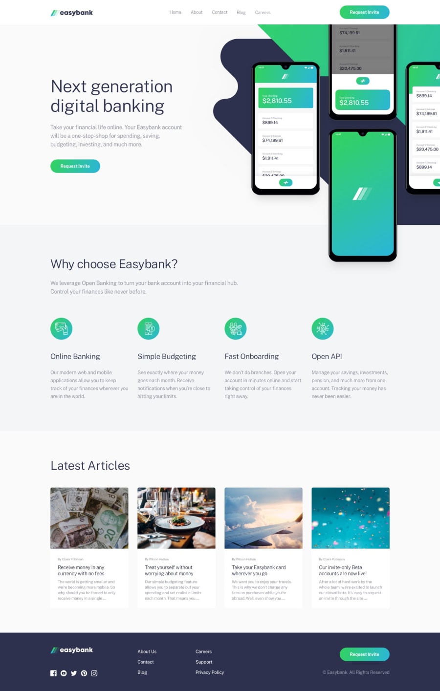
Design comparison
SolutionDesign
Solution retrospective
The page is still not fully responsive. Works perfectly for mobile (up to 35em) and larger screens (bigger than 60em). The main issue with responsiveness with different screen sizes now is manipulating the background img and the hero img of the page. It's been hard to understand how background images work, even harder when they are oddly positioned. Please feel free to leave any suggestions, I really appreciate it. Thank you.
Community feedback
Please log in to post a comment
Log in with GitHubJoin our Discord community
Join thousands of Frontend Mentor community members taking the challenges, sharing resources, helping each other, and chatting about all things front-end!
Join our Discord
