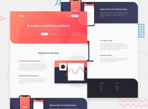
Responsive landing page, Gsap animation, Side panel on Sign up Button
Design comparison
Solution retrospective
Very fun project. I learn about gsap and its use. I tried not over due tho because i felt this design was not that appropiate for over the top gsap animation. I also learn how to use CSS selectors with attributes. Like .class[aria-expended=true] to simplified dropdown menu in js. That was quite interesting and made things easier.
I tired to follow as I could BEM naming convention for class but I think I lost myself.
The side panel (only on desktop) was the most interesting bit of this code.
Community feedback
- @iceoficePosted about 3 years ago
Hi there! Wow, your animation is sick! But yeah I think it is overkill for this design but maybe try to adjust the speed? I am not too sure about it. I also see on your mobile hamburger, it broke, I can see the error on the console, maybe you can check it out and try to fix it. In your mobile design, your paragraphs are broken, some are out of view some is too large (try to adjust the padding!). Other than that good job! I am new here so I hope it helps, I would love to learn those sick animations though hahaha. Hope we can help each other out in the future!
0
Please log in to post a comment
Log in with GitHubJoin our Discord community
Join thousands of Frontend Mentor community members taking the challenges, sharing resources, helping each other, and chatting about all things front-end!
Join our Discord
