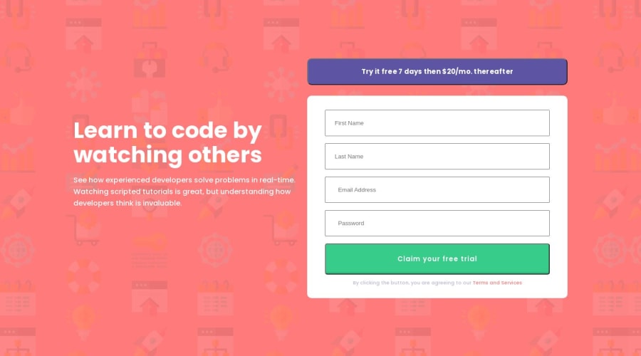
Design comparison
Solution retrospective
I have only completed the css side of this but wanted some advice.
So as it stands I submit my work then see the screen shot to find to find it is not "pixel perfect" So I go back do some adjustments and try again. Which isn't ideal, As there will be times in the future i wont have a tool like this.
So my question what is the correct approach? Should you be manually checking the padding of everything and changing accordingly? Should be limit everything with width and height? I want to use flex box or grid and have this flowing on all devices. Fore example I have centered this with flex box for the desktop view but its not aligned, instead of going back and "margin-top -2rem" Should I have done this a different way?
Community feedback
Please log in to post a comment
Log in with GitHubJoin our Discord community
Join thousands of Frontend Mentor community members taking the challenges, sharing resources, helping each other, and chatting about all things front-end!
Join our Discord
