Submitted over 1 year agoA solution to the Meet landing page challenge
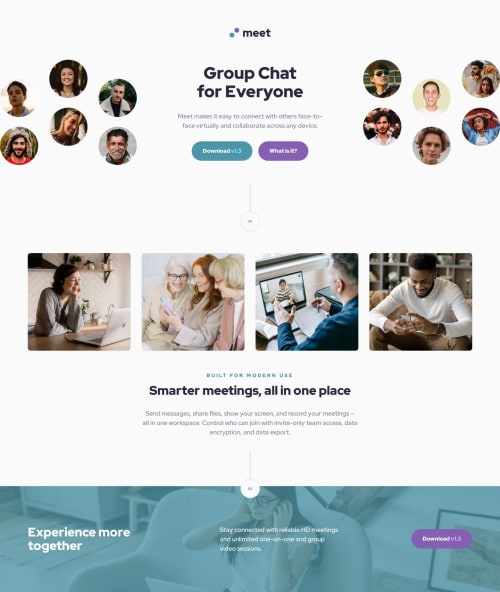
Responsive landing page for Meet using CSS Grid, SCSS
sass/scss
@LukasT1

Solution retrospective
What are you most proud of, and what would you do differently next time?
I think in this project I came as close as possible to the provided design files in Figma. Mostly it was a refresher for me on the concepts I have been using in previous challenges.
So I am slowly building up my confidence.
What challenges did you encounter, and how did you overcome them?The biggest challenge was with positioning the circle elements, especially after I added the animation. On hover it jumped around. But it was a simple bug in translateX property. But took a minute before I found it.
What specific areas of your project would you like help with?Would appreciate any comment on my work from more experienced developers.
Code
Loading...
Please log in to post a comment
Log in with GitHubCommunity feedback
No feedback yet. Be the first to give feedback on Lukáš T.'s solution.
Join our Discord community
Join thousands of Frontend Mentor community members taking the challenges, sharing resources, helping each other, and chatting about all things front-end!
Join our Discord