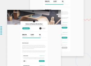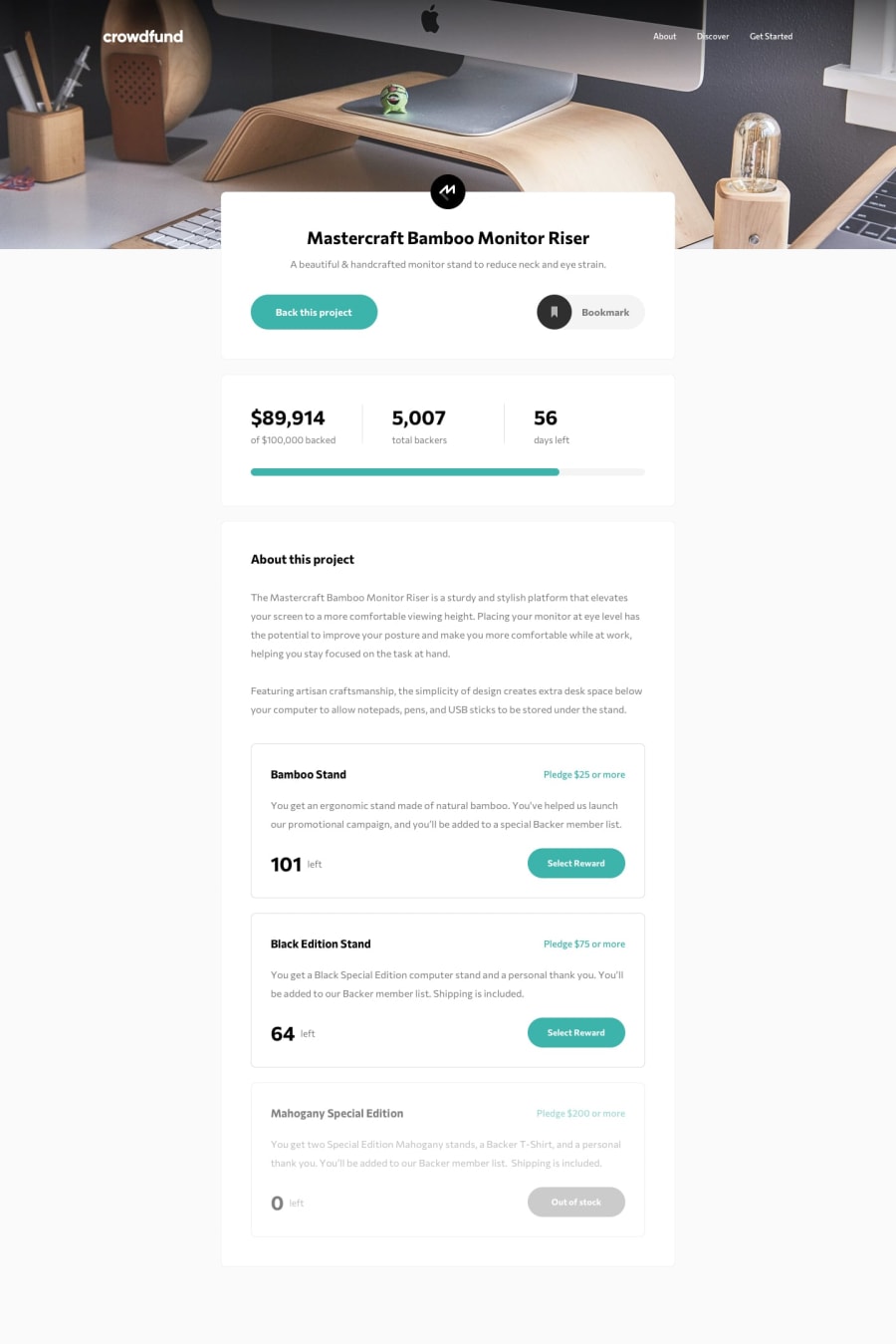
Responsive landing page for crowdfunding with SASS
Design comparison
Solution retrospective
Any feedback would be great.
Community feedback
- @grace-snowPosted over 2 years ago
Hi
This goes very narrow on mobile.
You need to be more careful with how you're using viewport units here as the header bar background isn't deep enough on mobile landscape and the modal background doesn't reach the bottom of the screen when I scroll.
It's also essential to trap focus and prevent background scroll when building modals. Scott o hara has written about this a lot, and Adrian roselli if you want to read more
Marked as helpful1@NAZIRwill29Posted over 2 years ago@grace-snow Thank you for the advice.
Yeah, it really is problem for modal background. I should testing my web by browse it in the phone also, rather than using the laptop alone.
0@NAZIRwill29Posted over 2 years ago@grace-snow thank you. I would work on the alt and aria-label.
0
Please log in to post a comment
Log in with GitHubJoin our Discord community
Join thousands of Frontend Mentor community members taking the challenges, sharing resources, helping each other, and chatting about all things front-end!
Join our Discord
