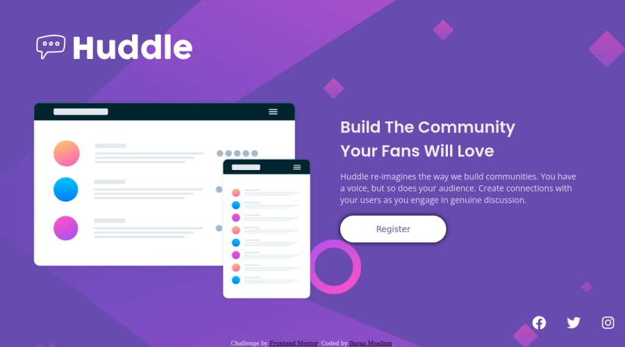
Responsive landing page using CSS grid and CSS flexbox
Design comparison
Solution retrospective
Hello, Frontend Mentor community. This is my solution for the Huddle Landing Page challenge. I've finished this challenge before, this time I tried to improve the responsivity using CSS grid. Happy to hear any feedback and advice!
Community feedback
- @elaineleungPosted about 2 years ago
Hi Baraa, I just wanted to answer your question about units because I answered another similar question today:
For handling responsiveness and best practices, I think I would focus more on the property than the unit in most situations. It's always best to use responsive properties such as
min-width
,max-width
, orwidth: min()
(something I use all the time) instead of just a fixed width. But generally speaking, it's best to use relative units such as em and rem over pixels, and I certainly would caution against using percentages and viewport widths if you're a beginner, but I do highly encourage much experimentation with these units before using them in a project. Anyway, Kevin Powell has an excellent video called "Are you using the right CSS units?", and I suggest you check it out to see what units should be used.Also, some general comments about your work here!
-
The star selector is normally used for normalize/reset styles; if you need to add styling such as for font color, that should go in the body selector.
-
The page looks a bit broken right now, to be honest! The image looks like it's overlapping with other things. You can try making the breakpoint higher as a start. Anyway, I'm not sure what's happening, but maybe you can try using a mobile-first approach.
-
I encourage you to use class selectors over id selectors, which have the highest specificity and can be difficult to change depending on the situation.
Those are some quick thoughts and observations, and anyway, hope this can help you out a bit!
Marked as helpful2 -
- @correlucasPosted about 2 years ago
👾Hello Baraa, Congratulations on completing this challenge!
I saw your solution preview site and I think it's already really good. Here’s some tips for you to improve it:
TO MAKE YOUR BACKGROUND DISPLAYING THE FULL SIZE USE
background-size: cover;
body { height: 100vh; background-color: hsl(257, 40%, 49%); font-family: "Open Sans"; background-image: url(../images/bg-desktop.svg); background-repeat: no-repeat; display: flex; background-size: cover; justify-content: space-evenly; align-items: center; flex-wrap: wrap; }
Use a CSS reset to avoid all the problems you can have with the default CSS setup, removing all margins, making the images easier to work, see the article below where you can copy and paste this css code cheatsheet: https://piccalil.li/blog/a-modern-css-reset/
✌️ I hope this helps you and happy coding!
Marked as helpful1@BaraaMoallemPosted about 2 years ago@correlucas That really helped me, thanks for your help :D
0 - @UrbanskiDevPosted about 2 years ago
Hello Baraa !
Congratulation for finishing the project
To answer your question the first part of your question, I have a link which will helps you to understand better which units to use for :
To adapt the screen size, I recommend you to follow the "Mobile First" design ! It means you start by building your page for a mobile phone viewport. When you finished, you can continue the responsive with a bigger screen size, which will be easier to adapt, and also easier to find your breakpoint !
Here's a link which explain it in more depth:
For your last point, CSS Grid is a good choice, it may not be easy to use, but it is a very powerful tool !
I have found a mini-game, which allow you to learn grid and make it easier to understand how to use it :
I hope it helps you, keep learning and happy coding !
Marked as helpful1@BaraaMoallemPosted about 2 years ago@UrbanskiDev Thank you very much for your helpful feedback
0
Please log in to post a comment
Log in with GitHubJoin our Discord community
Join thousands of Frontend Mentor community members taking the challenges, sharing resources, helping each other, and chatting about all things front-end!
Join our Discord