Submitted about 3 years ago
Responsive Landing Page, Flexbox SASS & SCSS
#accessibility#sass/scss
@HernanMorel
Design comparison
SolutionDesign
Solution retrospective
Hello everyone,
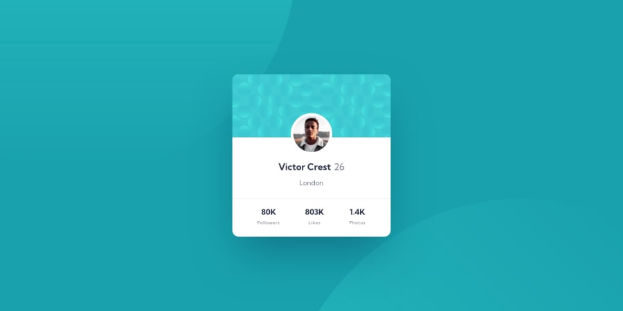
This is my submission for the profile card challenge. Had a lot of fun building this with one. I opted to create the background circles with CSS as opposed to using a static image. I enjoyed the challenge of forming and creating their shadows and adjusting their rotational positioning accordingly. I used flexbox for positioning and moved repetitive colors, font-weights/sizes, css-reset, and main body styles to SCSS values and sub-folders. I would appreciate any and all feedback!
Thank you!
Community feedback
Please log in to post a comment
Log in with GitHubJoin our Discord community
Join thousands of Frontend Mentor community members taking the challenges, sharing resources, helping each other, and chatting about all things front-end!
Join our Discord
