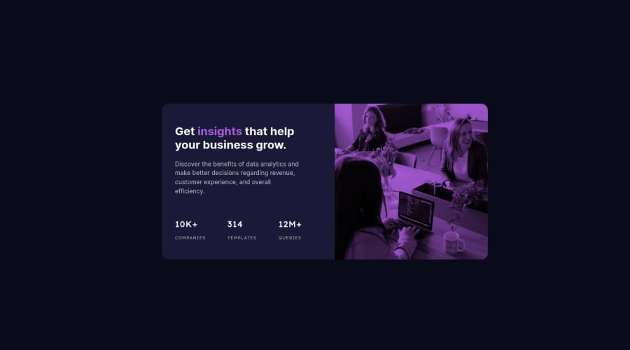
Design comparison
Solution retrospective
Any suggestions are very welcome!
Community feedback
- @correlucasPosted about 2 years ago
👾Hello Vanessa, Congratulations on completing this challenge!
Great code and great solution! I’ve few suggestions for you that you can consider adding to your code:
Set the
opacityaround80%to have a better blend between the purple and the image:@media (min-width: 800px) .main-img { border-top-left-radius: 0; border-bottom-right-radius: 1em; object-fit: cover; opacity: 80%; height: 100%; max-width: 350px; }✌️ I hope this helps you and happy coding!
Marked as helpful0 - @VCaramesPosted about 2 years ago
Hey @VanessaAz, some suggestions to improve you code:
-
Change the
max-widthof you component container to 1110px to have the correctwidth. -
Delete the
<div class="img-container">the Picture Element is your container. -
The image serve no other purpose than to be decorative; It adds no value. The Alt Tag should left blank and have an aria-hidden=“true” to hides it from assistive technology.
-
Change the
max-width: 350px;tomax-width: 100%and addobject-fit: cover; -
Apply the following code to have each side take up the equal amount.
Code:
main > * { flex-basis: 50% }-
The statistics section is a list of statistics, so it should be built using an Unordered List along with a List Items Element.
-
Increase the
font-sizeof the texts and numbers to better match the FEM example.
Happy Coding! 👻🎃
0 -
Please log in to post a comment
Log in with GitHubJoin our Discord community
Join thousands of Frontend Mentor community members taking the challenges, sharing resources, helping each other, and chatting about all things front-end!
Join our Discord
