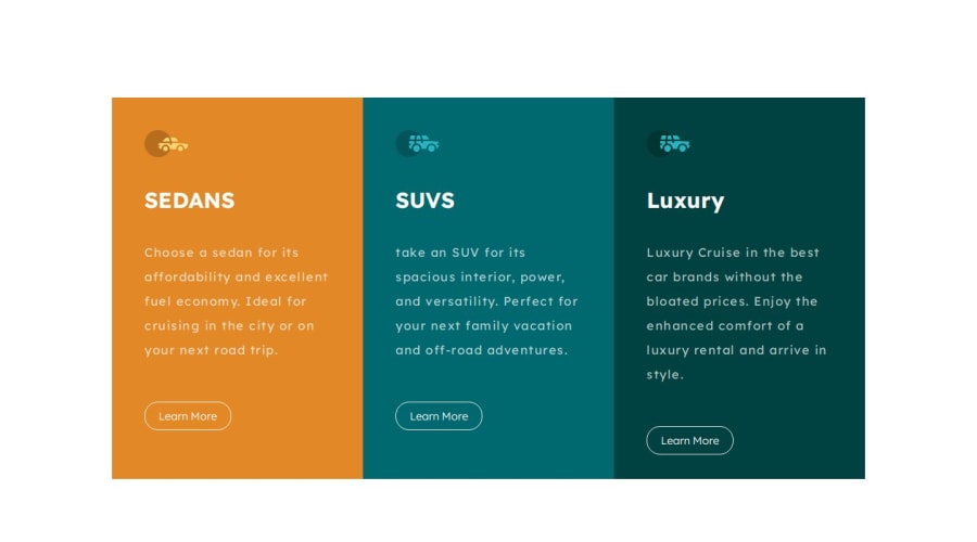
Design comparison
SolutionDesign
Solution retrospective
What are you most proud of, and what would you do differently next time?
I feel good about myself for going that far.
What challenges did you encounter, and how did you overcome them?to make the responsive layout
What specific areas of your project would you like help with?responsive design
Community feedback
- @xaintobasPosted 10 months ago
Hi @mahmoud17-cmyk,
Great job on the 3 columns component! Here are a few suggestions that might enhance it further:
- Spacing Between Elements: To ensure all elements in your box container are evenly spaced and aligned, consider adding equal spaces between them. This can be achieved by modifying your CSS like this:
.box { display: flex; flex-direction: column; justify-content: space-between; }- Font for h1 Element: To improve the visual appeal, consider using the recommended font for your h1 element:
h1 { font-family: "Big Shoulders Display", sans-serif; }- Anchor Elements State: Currently, all your anchor elements appear to be in an active state. To enhance user experience, consider adjusting their states appropriately.
Keep up the good work, and feel free to comment below if you need further assistance!
Hope to be helpful.
0
Please log in to post a comment
Log in with GitHubJoin our Discord community
Join thousands of Frontend Mentor community members taking the challenges, sharing resources, helping each other, and chatting about all things front-end!
Join our Discord
