Design comparison
Solution retrospective
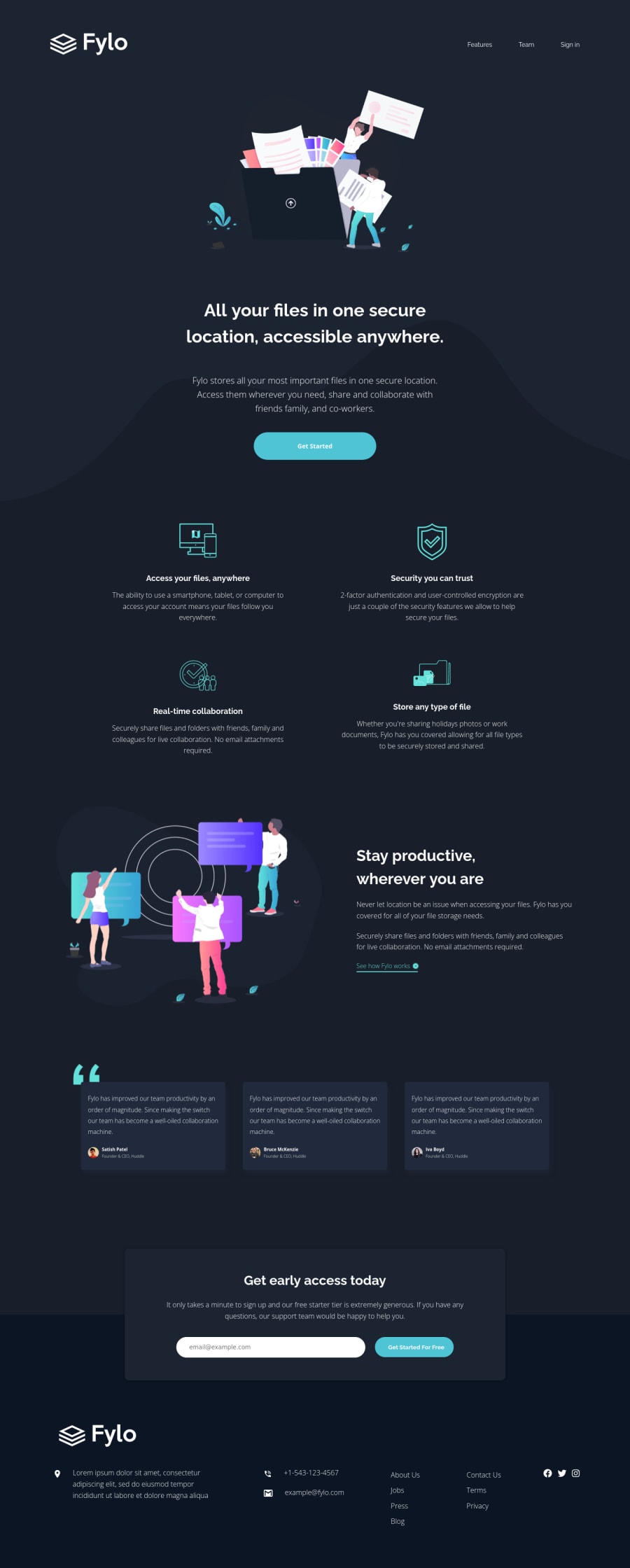
This is the work I submitted for the technical interview exam. I am happy to hear your critic or reactions.
Community feedback
- @isprutfromuaPosted over 2 years ago
Hi there. You did a good job 😎
keep improving your programming skills🛠️
your solution looks great, however, if you want to improve it, you can follow these recommendation:
**HTML**
✅ Avoid complex wrapping. For better performance please tried to avoid unnecessary wrapping. It will create unnecessary node in your HTML tree and reduce performance too.
<div> <div class="footer__contact"> <img src="./images/icon-phone.svg" alt="phone" class="footer__icons footer__icons--phone"> <p>+1-543-123-4567</p> </div> <div class="footer__contact"> <img src="./images/icon-email.svg" alt="phone" class="footer__icons footer__icons--email"> <p>[email protected]</p> <---- <a> is preferred here </div> </div>
✅ Write Code Comments. It’s best practice to write human-readable code. Tried to comment your block of code. It will help you or any other developer to refactor the piece of code blocks.
✅ Use the figure element to add captions to your images in HTML. It's advisable to use the <figure> element when adding captions to your images. It is important to use the <figcaption> element along with the <figure> element for it to work.
<img src="./images/icon-access-anywhere.svg" alt="" class="features__image"> <h2 class="features__heading">Access your files, anywhere</h2> <p class="features__sub-heading">The ability to use a smartphone, tablet, or computer to access your account means your files follow you everywhere.</p>
**CSS**
✅ Don’t use @import . The @import directive is much slower than the other way to include stylesheets into a html document:
<link rel='stylesheet' type='text/css' href='a.css'> <link rel='stylesheet' type='text/css' href='font.css'>
✅ Avoid Extra Selectors. Adding extra selectors won't bring Armageddon or anything of the sort, but they do keep your CSS from being as simple and clean as possible.
.intro__image img .banner__image img
✅ Use Clamp . The clamp function make smaller and simple CSS to control element width.
width: clamp(100px, 50%, 300px); U can apply it here .header__logo img { width: 8rem; } @media (min-width: 64em) { .header__logo img { width: 17.6rem; } }
✅ Use CSS Variables . Making the code flexible is equally important so that refactoring won’t be a problem for you. One of the best ways to achieve this is variables.
I hope my feedback will be helpful. You can mark it as useful if so 👍 it is not difficult for you, but I understand that my efforts have been appreciated
Good luck and fun coding 🤝⌨️
Marked as helpful1@jlpastoPosted over 2 years ago@isprutfromua hi thanks a lot. Your comment is really helpful. Have a great day :)
0@isprutfromuaPosted over 2 years ago@jlpasto I'm glad that my comment was helpful to you.
Contact me if you have any questions
Cheers
0
Please log in to post a comment
Log in with GitHubJoin our Discord community
Join thousands of Frontend Mentor community members taking the challenges, sharing resources, helping each other, and chatting about all things front-end!
Join our Discord