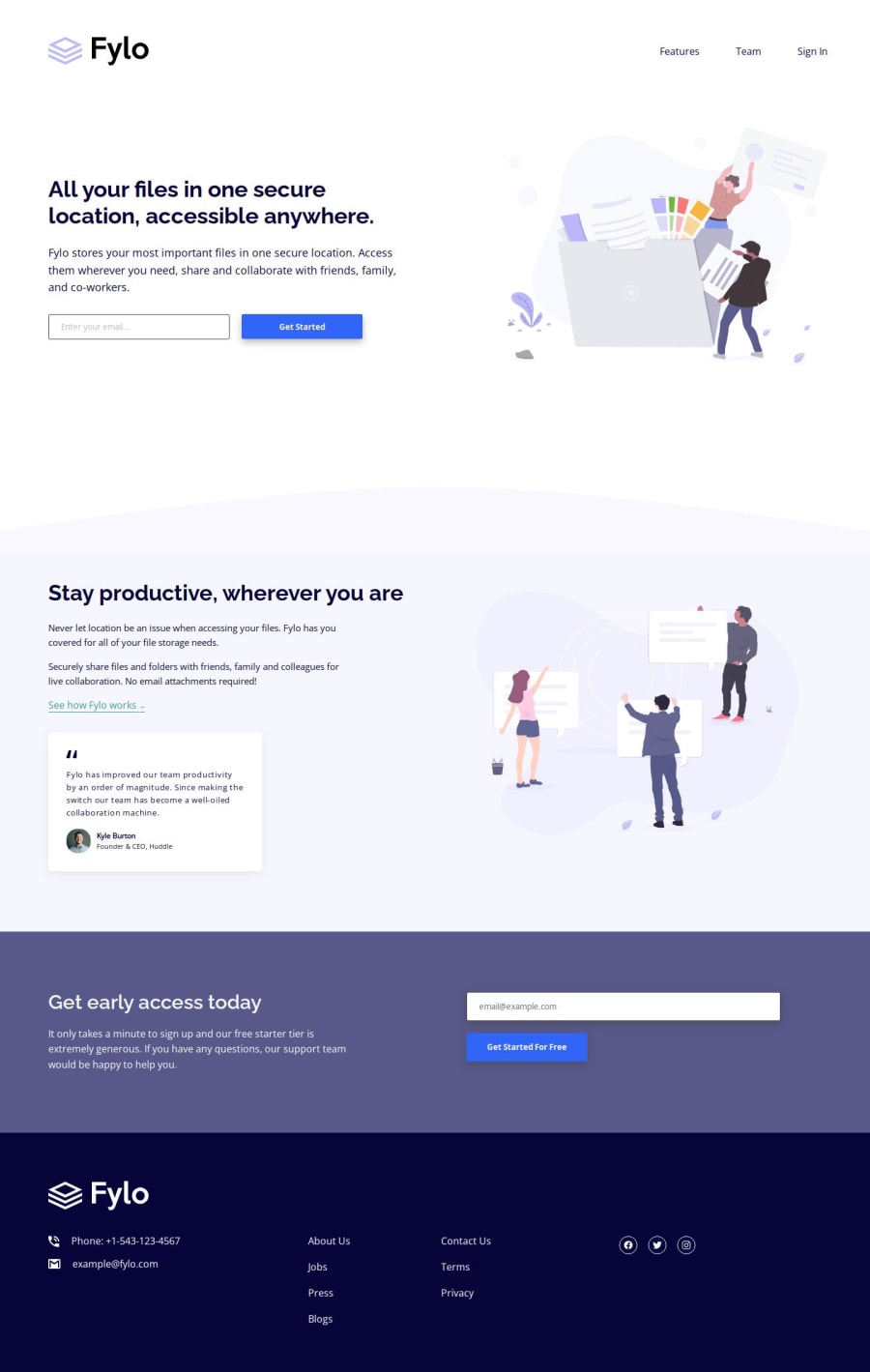
Design comparison
Solution retrospective
When doing media queries it wasn't demanding at all as it required only small changes in font-sizes and gaps, all thanks to well written html and stylesheet. This was after I revised my html, so next time I would think more thoroughly about setting divs and containers.
What challenges did you encounter, and how did you overcome them?I grouped more things than I should have done. For example, illustrations, gaps, buttons, etc. They seem to be same in size or paddings, but it's not the case once you look a bit closer at the initial design. So I had to regroup things and assign them different classes.
What specific areas of your project would you like help with?I am not sure how to manipulate svg format. How to adjust size, or change anything for that matter. Also, how to change the logo size? How to make the email field to notify you something after clicking on the button?
Community feedback
Please log in to post a comment
Log in with GitHubJoin our Discord community
Join thousands of Frontend Mentor community members taking the challenges, sharing resources, helping each other, and chatting about all things front-end!
Join our Discord
