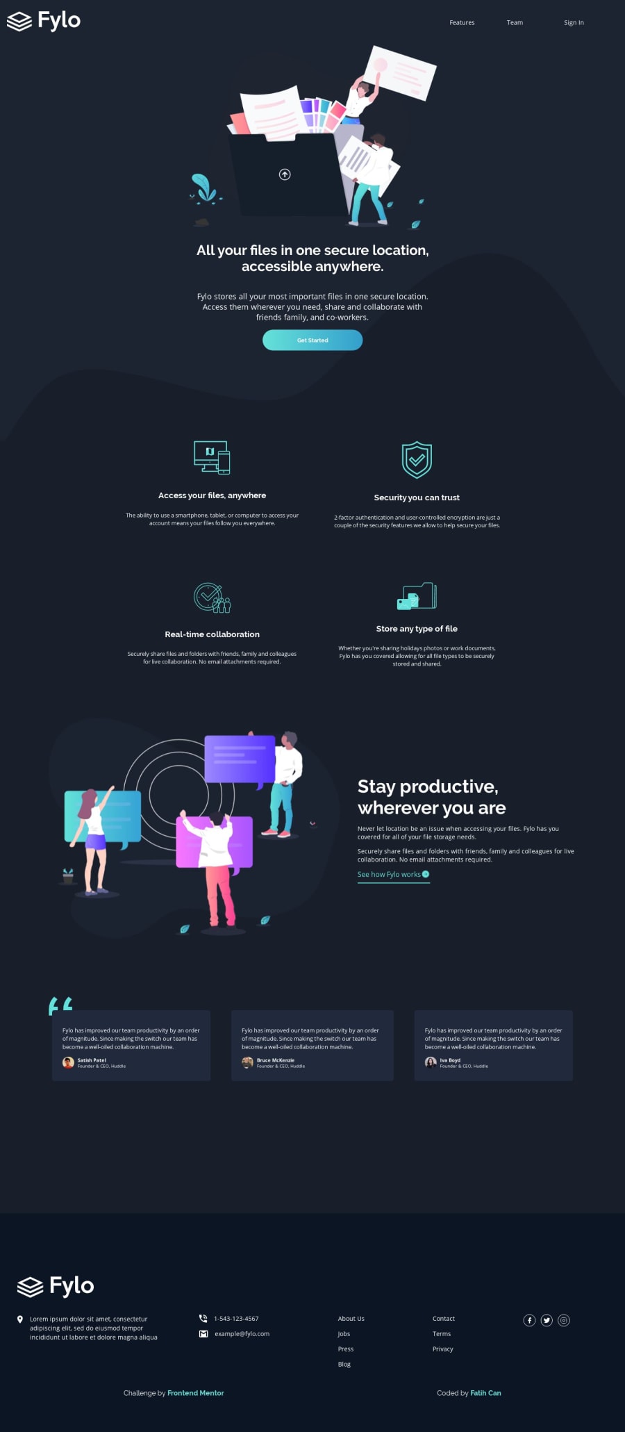
Responsive Landing Page (CSS Grid, CSS Flexbox, Sass, No Bootstrap)
Design comparison
Solution retrospective
It's not a question but i wanna say that after learning CSS grid, you'll see how easier it is than Bootstrap to design responsive layouts. It was a great experience designing this. Learned many things. Have a nice day people!
Edit: Well, the early access section is hiding somewhere in the preview but I can see it on the live site or my code. It is an absolute section, do you think that causes it? (SOLVED! Thanks to Gerben for his solution.) And comparison looks different, I don't know why but preview site looks normal.
Community feedback
- @GerbenDolPosted about 5 years ago
Hey Fatih, I'm sure the
position: absoluteis breaking your early acces area.I think you might want to rewrite it without it and try pulling it down over the footer using a negative
margin-bottomor move it down usingtransform: translateY().Otherwise great looking page! I agree that CSS grid is a huge help in these layouts!
0
Please log in to post a comment
Log in with GitHubJoin our Discord community
Join thousands of Frontend Mentor community members taking the challenges, sharing resources, helping each other, and chatting about all things front-end!
Join our Discord
