Responsive Landing Page (CSS Flexbox, Tailwind CSS, VanillaJS)
Design comparison
Solution retrospective
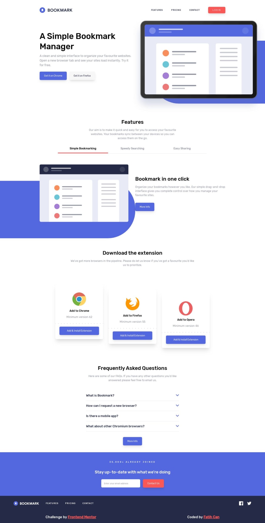
The preview looks messy but it must look okay on inspector.
Community feedback
- @GerbenDolPosted almost 5 years ago
Hey Fatih! Great to see you managed to finish the challenge, nice job! 😁
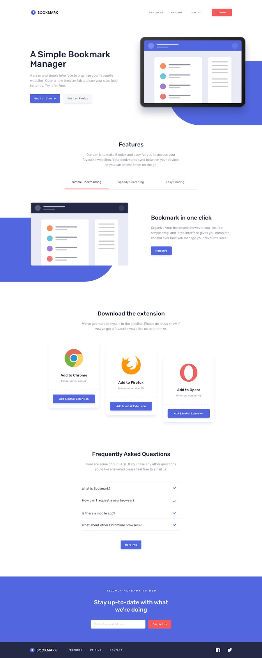
I can see you did really have some issues with the images and the purple backgrounds. I think by making the image
position: absolute;you made it hard for yourself to leverage the resizing nature of the image as it's taken out of the flow of the page. 🙈I think learning a bit more about using
position: absolute;and it's power when relative to the proper parent could be a nice way for you to later revisit this challenge and kill the image part! 💪🏻1
Please log in to post a comment
Log in with GitHubJoin our Discord community
Join thousands of Frontend Mentor community members taking the challenges, sharing resources, helping each other, and chatting about all things front-end!
Join our Discord
