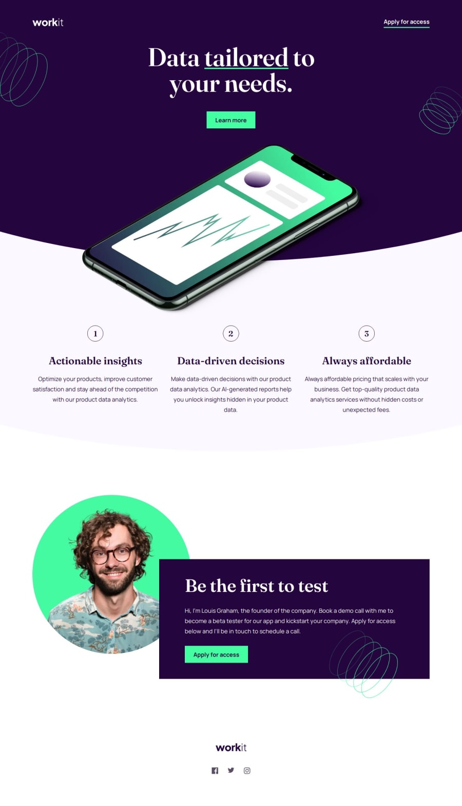
Design comparison
Solution retrospective
Finally out of the course and tutorial loop, I had to build this on my own based on what I learned.
I think I learned a lot. It helped me refresh my memory on many things I had already learned but never used on my own.
What challenges did you encounter, and how did you overcome them?It took longer than expected, and after my first try, I decided to do it all over again. I ended up with lots of media queries and unmanageable code and still had many glitches.
I used a different approach to rely mostly on CSS grid. It helped a lot since I had to write just a few media queries.
I still struggled with the background to make it as close to the design file as possible. Not sure if the clip-path property was the right approach, but it worked. Rounded edges seemed simpler, but I could not adjust them to look close to the design file.
What specific areas of your project would you like help with?Since I am a newbie, I’ll appreciate any tips. It is still a lot of trial and error on my part, so my code organization is not very neat.
Community feedback
Please log in to post a comment
Log in with GitHubJoin our Discord community
Join thousands of Frontend Mentor community members taking the challenges, sharing resources, helping each other, and chatting about all things front-end!
Join our Discord
