Design comparison
SolutionDesign
Solution retrospective
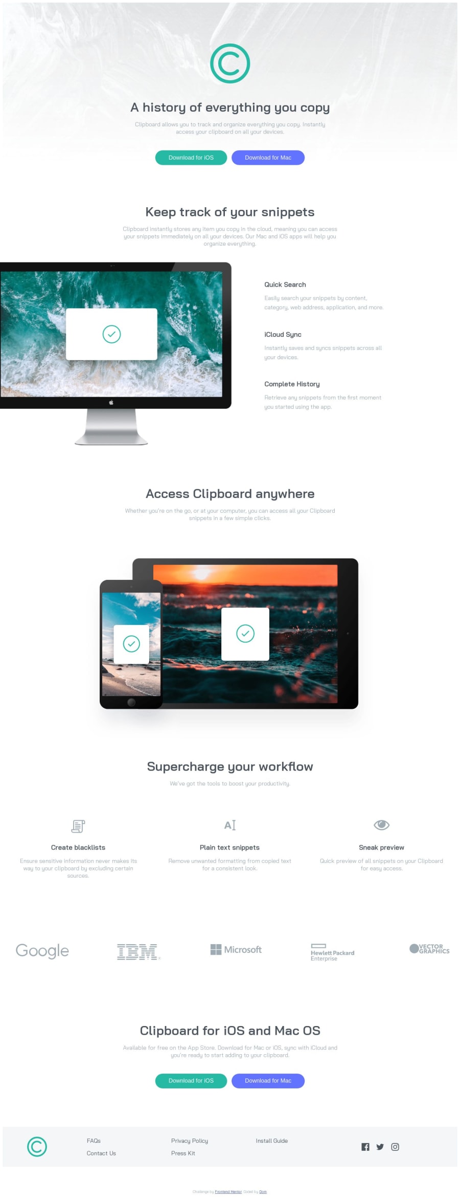
This is my approach to clipboard landing page challenge. I would be happy if someone told me how to keep "monitor-section" centered on wider screen with "img" still being a little out of the screen like in the design. This is tagged as junior level but how it actually compares to real junior front-end developer job?
Community feedback
- @quenyoniPosted over 1 year ago
Hey! To have the monitor come out a bit I think you'd have to create another container for the image. This way you can set the position of this container to relative then, have the image have a position of absolute so you can move it around. Hope that helps.
0
Please log in to post a comment
Log in with GitHubJoin our Discord community
Join thousands of Frontend Mentor community members taking the challenges, sharing resources, helping each other, and chatting about all things front-end!
Join our Discord
