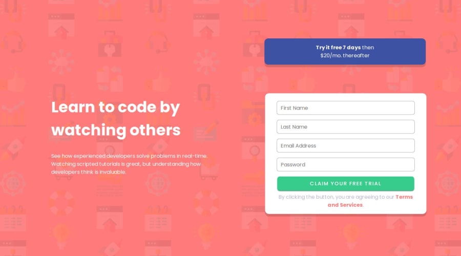
Design comparison
Solution retrospective
I'm really getting better at the Media Queries thing. I didn't put much effort to this project because I'm focusing on a JS course I've been doing (which progress you may be able to see in my HelloWorld public repository) so this doesn't represent my full potential, and that makes even more excited.
What specific areas of your project would you like help with?I need help
I couldn't get the active status to match up the challenge's preview. I don't know how to put a "!" symbol at the end of a input field without having to use position absolute, which would make my site very not responsive, so if anyone has a better idea I'd be grateful to read and add it to the project!
Community feedback
- @markuslewinPosted 8 months ago
I think absolute positioning sounds like a great idea. As long as you manage to contain the "!" inside the text field, the page shouldn't get any less responsive! You could also use a 2-column grid to layer the elements.
Marked as helpful1@ArthurResendeCPosted 8 months agoReally, @markuslewin?
Well, if you say so, I'll try to implement the absolute positioning idea. About the 2-column grid, I have no clue on how to do it but I'll study the concept later.
Thank you so much for your time!
Have a nice one!
1
Please log in to post a comment
Log in with GitHubJoin our Discord community
Join thousands of Frontend Mentor community members taking the challenges, sharing resources, helping each other, and chatting about all things front-end!
Join our Discord
