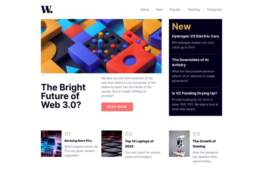
responsive landing page built with TailwindCss and some of JS
Design comparison
Solution retrospective
- Difficulty I found on this project is responsiveness, trying to come up with a result that matches the design as much as I can.
- I would appreciate your feedback. Thank you.
Community feedback
- @AdrianoEscarabotePosted over 2 years ago
Hello karim, how are you? I truly loved your project's outcome, however I have some advice that I hope you'll find useful:
I noticed that you used a
buttonin which case the best option would be ana, because in my head when a person clicks on a button written Read more, he is not confirming a form, or something like, it will be redirected to another page, to read more about!to solve this problem do this:
<a href="/">READ MORE</a>For a user to know that an element is clickable we need to use the
cursorattribute with the valuepointer!The remainder is excellent.
I hope it's useful. 👍
Marked as helpful1@karimAoulallayPosted over 2 years ago@AdrianoEscarabote Yes you're right, thank you so much.
1
Please log in to post a comment
Log in with GitHubJoin our Discord community
Join thousands of Frontend Mentor community members taking the challenges, sharing resources, helping each other, and chatting about all things front-end!
Join our Discord
