Submitted over 1 year ago
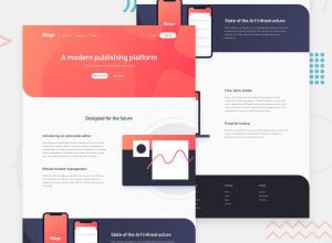
Responsive landing page built with Tailwind CSS
#tailwind-css#vite
@RoksolanaVeres
Design comparison
SolutionDesign
Solution retrospective
The most difficult parts of the challenge were the layout (with all its background images and gradients all at once) and the dropdown menus, especially in the mobile version. Also, I'm not satisfied with my JS part. If someone has any suggestions on how to improve it, please share)
Community feedback
Please log in to post a comment
Log in with GitHubJoin our Discord community
Join thousands of Frontend Mentor community members taking the challenges, sharing resources, helping each other, and chatting about all things front-end!
Join our Discord
