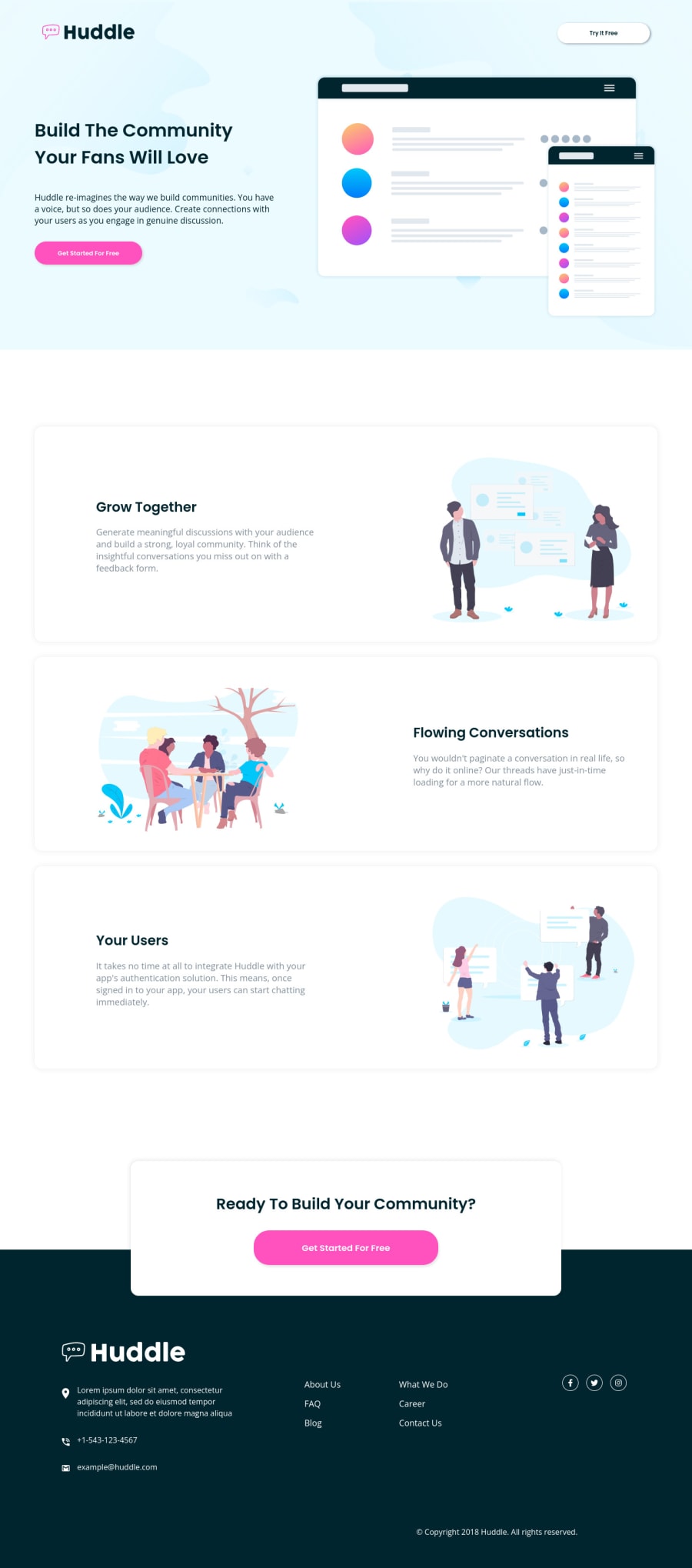
Design comparison
SolutionDesign
Solution retrospective
it works :D I'm not really proud of the way it's done though. I feel that I should plan it better (mainly structure, for both mobile and desktop), before I started to adjust layout. What worked great for mobile (which I did first), just broke when resized to max width and had to be adjusted in both html and css - kind of frustrating.
but, it works :D if anyone manages to look at my code without a headache, feel free to give me some feedback. thank you :D
Community feedback
Please log in to post a comment
Log in with GitHubJoin our Discord community
Join thousands of Frontend Mentor community members taking the challenges, sharing resources, helping each other, and chatting about all things front-end!
Join our Discord
