Design comparison
Solution retrospective
Building a fully responsive slider project down to 375 px was a rewarding experience.
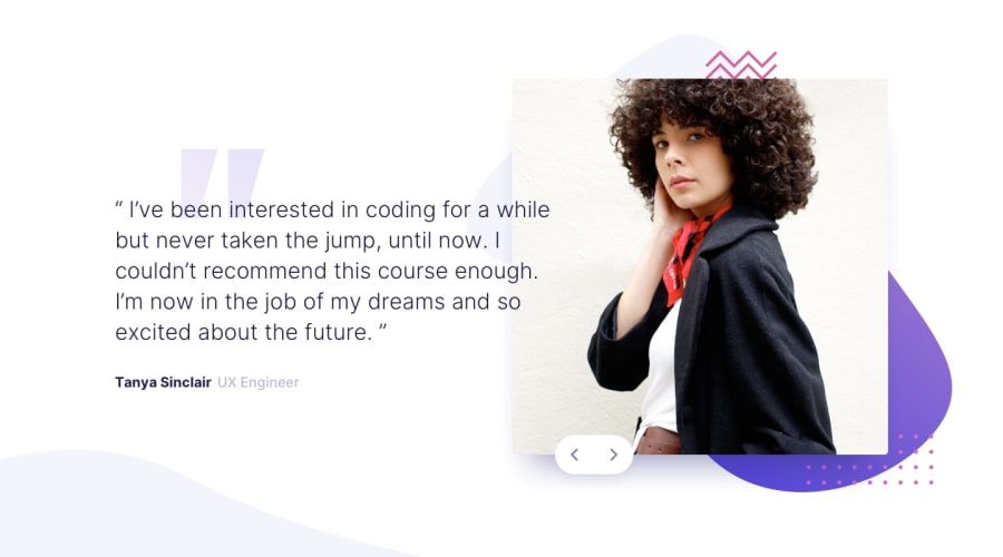
I added two extra slides to the project. The testimonial photos I got from pexels.com and the testimonial statements were generated by Windows Copilot. Amazing AI app.
What challenges did you encounter, and how did you overcome them?Working with the responsive design in the Webflow template is somewhat more difficult than the usual responsive design. I had to experiment with this more than usual, but I was able to work through the problems. There was one challenge that I was not able to achieve and that was placing the graphic background image around the testimonial images.
What specific areas of your project would you like help with?Placing the graphic background image on the testimonial images in Webflow.
Community feedback
Please log in to post a comment
Log in with GitHubJoin our Discord community
Join thousands of Frontend Mentor community members taking the challenges, sharing resources, helping each other, and chatting about all things front-end!
Join our Discord
