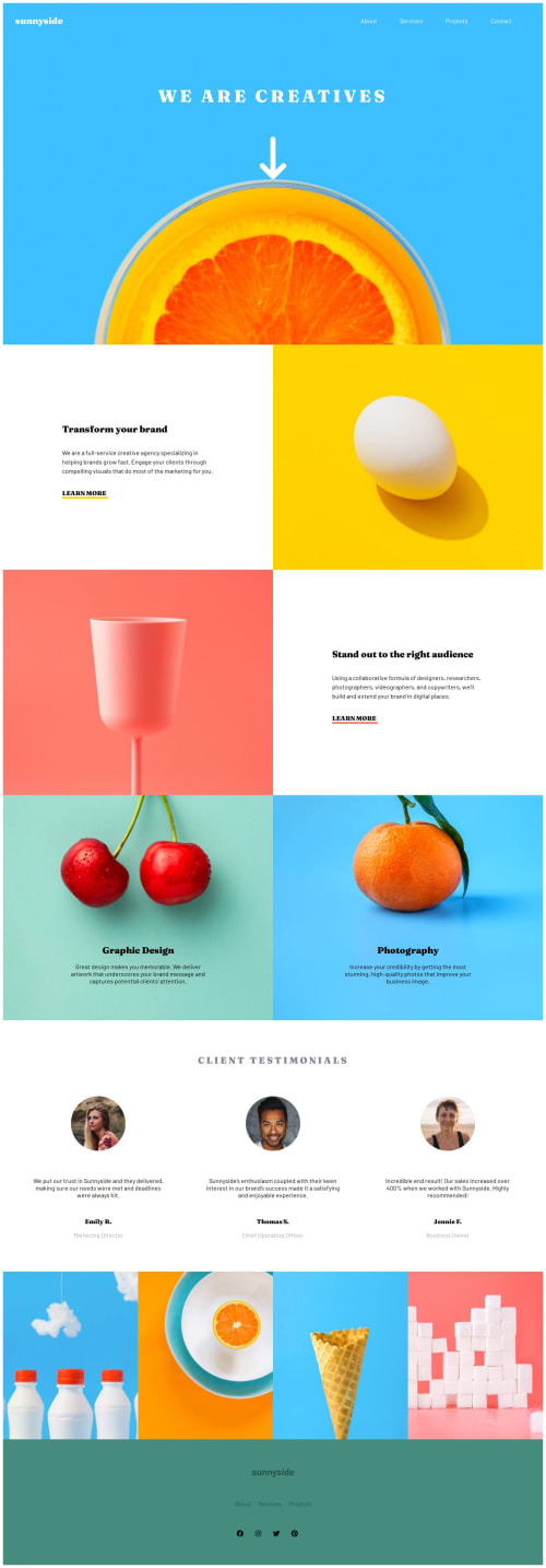
Responsive landing page, built using ReactJS, CSS Grid and Flexbox

Solution retrospective
I'm proud of building a mobile-friendly navigation menu with a hamburger icon and mastering Flexbox and Grid for a responsive layout. I used React's useState hook for menu state management, ensuring a dynamic experience. For the future, I plan to implement a slider for the photo gallery, focusing on state management to control the active image and adding navigation buttons for a smoother user experience.
What challenges did you encounter, and how did you overcome them?One aspect I spent some time on was refining the positioning of elements using Flexbox and Grid. I experimented with various layout configurations, adjusting properties like display, justify-content, align-items etc. I also utilised browser developer tools to test responsiveness across different screen sizes, ensuring a consistent and adaptable design.
Please log in to post a comment
Log in with GitHubCommunity feedback
No feedback yet. Be the first to give feedback on Kuvashnee Naidoo's solution.
Join our Discord community
Join thousands of Frontend Mentor community members taking the challenges, sharing resources, helping each other, and chatting about all things front-end!
Join our Discord