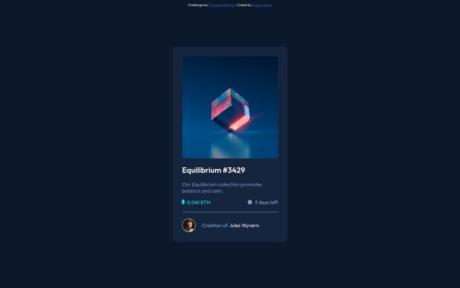
Responsive landing page built using HTML CSS and flexbox
Design comparison
Solution retrospective
Any feedback is appreciated. Thanks!
Community feedback
- @MojtabaMosaviPosted almost 3 years ago
1- Authors name shoud be a link because its expected to be interactive.
2- Usinga div for the the horisontel line is totally fine but remember that you shoud always prioritize native html element, in this case you could use <hr> element.
3-Only a decorative image should be implemented as background, in this case since its digital art site you the image is not merely decorative because without it the line "equilibrium #34429" would make less sense.
Keep coding :=)
1@Dseals82Posted almost 3 years ago@MojtabaMosavi I appreciate the feedback! I will make the updates !
0 - @hatwell-jonelPosted almost 3 years ago
great job! i suggest that you fix the accessibility and html issues for better user accessibility. happy coding, keep it up 👍👍👍
1@Dseals82Posted almost 3 years ago@hatwell-jonel Thanks so much! I will rectify the issues!
0
Please log in to post a comment
Log in with GitHubJoin our Discord community
Join thousands of Frontend Mentor community members taking the challenges, sharing resources, helping each other, and chatting about all things front-end!
Join our Discord
