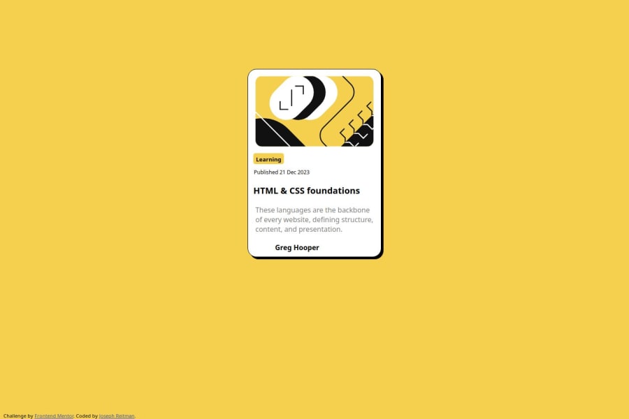
Design comparison
SolutionDesign
Solution retrospective
What are you most proud of, and what would you do differently next time?
Very simple project. Just needed to adapt code for the last challenge to this one.
What challenges did you encounter, and how did you overcome them?Just more experimenting with css formatting to get everything to fit correctly. Not sure if my solutions are the best, but will learn better practices as they become necessary.
What specific areas of your project would you like help with?I had issues getting the text to align to the left side correctly. There's probably a better way of doing that I'm not aware of.
Community feedback
Please log in to post a comment
Log in with GitHubJoin our Discord community
Join thousands of Frontend Mentor community members taking the challenges, sharing resources, helping each other, and chatting about all things front-end!
Join our Discord
