Design comparison
Community feedback
- @asmthliPosted 4 months ago
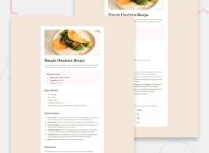
Hi! Nice work. Just as some positive criticism, I would say you could perhaps look at choosing HTML containers with closer matching semantics. For example you used an unordered list for the nutrition information at the bottom of the page. You have created a table-like layout using an unordered list but you could have used an actual HTML table. This would make it more accessible for screen readers, as well as arguably making the HTML easier to read.
Another tip might be to look into using variables in your CSS for things such as the colours. They are arguably not necessary here but it might make the code more readable if you are using the same colour in multiple places (for example, seeing the colour variable 'main colour' in multiple places, it is easier to recognise that those elements use the same colour, as opposed to seeing just a hex value e.g. #FF2B11). Of course there are other benefits, too.
Hope this was of some help at least.
0
Please log in to post a comment
Log in with GitHubJoin our Discord community
Join thousands of Frontend Mentor community members taking the challenges, sharing resources, helping each other, and chatting about all things front-end!
Join our Discord
