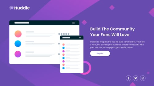
Submitted over 3 years agoA solution to the Huddle landing page with a single introductory section challenge
Responsive landing page
@maiaflow

Solution retrospective
Feeling pretty happy with this. Tried to get my screenshot pixel perfect even though I know I shouldn't do that- I did make a couple choices, like the range in between desktop and mobile, that I'm happy with. Always wondering if I could have done anything better!
Code
Loading...
Please log in to post a comment
Log in with GitHubCommunity feedback
No feedback yet. Be the first to give feedback on maia's solution.
Join our Discord community
Join thousands of Frontend Mentor community members taking the challenges, sharing resources, helping each other, and chatting about all things front-end!
Join our Discord