Design comparison
SolutionDesign
Solution retrospective
What are you most proud of, and what would you do differently next time?
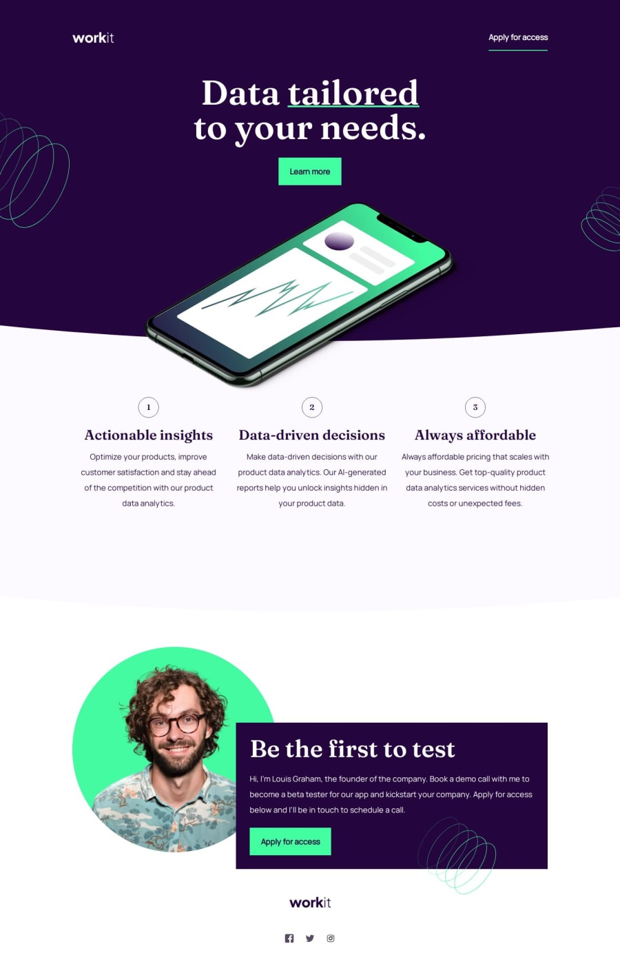
I had this exercise lying around for some time and just couldn't figure out how to add the curves, how to properly position my image. Upon refactoring the code I'd written all this time ago, I noticed how much progress I've made in my understanding and use of css. I took a few different approaches, putting the focus a bit more on utility classes, and narrowed down my css, wherever I saw fit.
Please log in to post a comment
Log in with GitHubCommunity feedback
No feedback yet. Be the first to give feedback on Katrien Schuermans's solution.
Join our Discord community
Join thousands of Frontend Mentor community members taking the challenges, sharing resources, helping each other, and chatting about all things front-end!
Join our Discord
