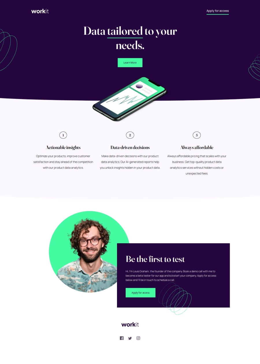
Design comparison
Solution retrospective
I'm most proud of extending the elements with borders beyond the viewport width and ensuring that part wasn't scrollable so that I could dial in the right amount of curve!
That part broke my spirit for awhile, but once I found it I kept chugging along.
What challenges did you encounter, and how did you overcome them?I encountered MANY, but as with all things programming I took to the internet, StackOverflow and MDN to review how I could do what I needed to do.
The hardest parts of the challenge for me were:
- Appropriately handling z-index
- Keeping track of relative and absolute elements
- Bloat in my CSS
- Remember to compile my sass!!!!
- Managing three different breakpoints
Honestly, the hardest part for me would have to be managing the three different breakpoints. I shipped the project because I want to be able to look back at my progress but I am aware that my media queries are a nightmare.
I also most definitely have conflicting CSS rules and also plenty of rules that are doing nothing at all.
Going forward I need to be better about keeping track of my rules and not let them get away from me like they did here.
Community feedback
Please log in to post a comment
Log in with GitHubJoin our Discord community
Join thousands of Frontend Mentor community members taking the challenges, sharing resources, helping each other, and chatting about all things front-end!
Join our Discord
