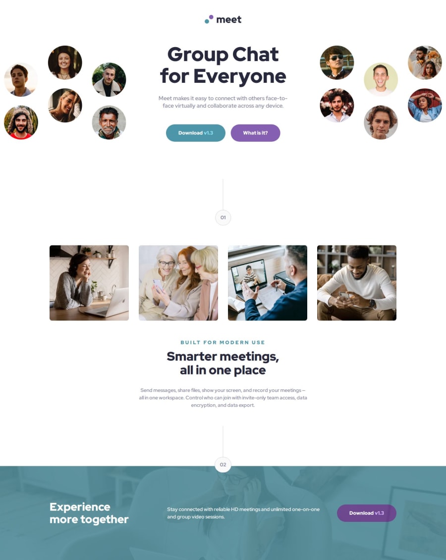
Design comparison
SolutionDesign
Community feedback
- P@tomwinskellPosted 5 months ago
🤩🤩 Nice work! Your solution looks awesome. 🤩🤩
- Responsive.
- Different layouts as per the design for desktop, tablet and mobile.
- Colours, fonts, spacing and buttons are spot on.
🤔 Here's something to consider. I hope my explanation is clear. Sorry if you already know this.
- Your reset may of actually caused you some difficulty when applying the styles you wanted. For example, on the design the header or hero image is full width and actually the page.
- Your reset provides every image with the css property:
max-width: 100%. However, for your hero image you ideally want it to bewidth: 110vwor similar. - It would be difficult to apply this custom style with your current setup.
Why?
- Ideally a css reset should be linked before your custom css styles. Css is a cascade meaning that properties lower in the stylesheet override those above. That's why media queries for breakpoints typically go at the bottom of the stylesheet.
- There's a good explanation by Shay Howe here.
- Your link in index.html to the reset is below your custom stylesheet. I'd switch it around or even
@importthe reset at the top of your custom stylesheet. See here.
0
Please log in to post a comment
Log in with GitHubJoin our Discord community
Join thousands of Frontend Mentor community members taking the challenges, sharing resources, helping each other, and chatting about all things front-end!
Join our Discord
