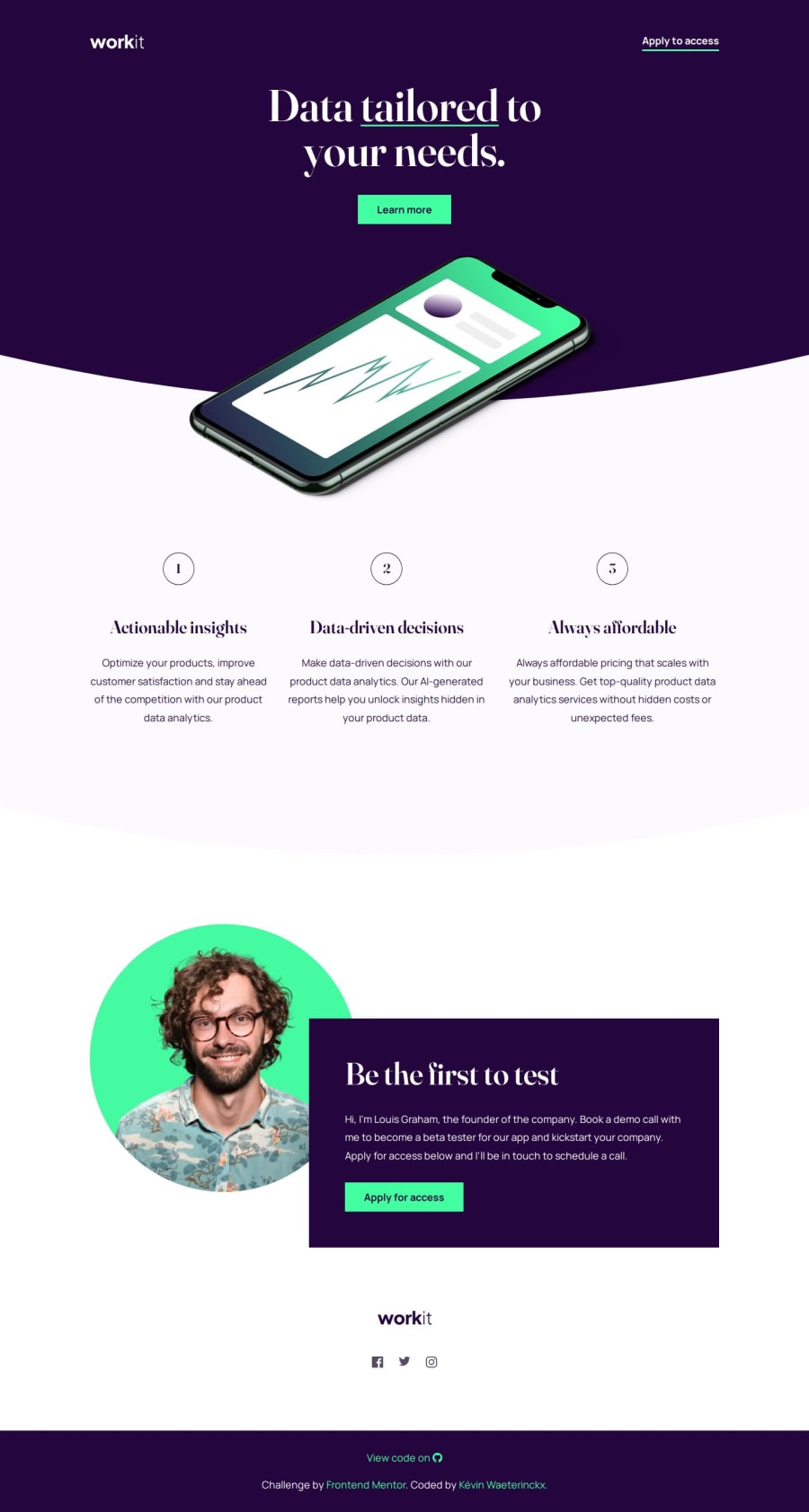
Design comparison
Solution retrospective
I tried using SVG code in order to achieve the curve, and make it responsive as well to grow with the width of the screen. It came out very nice. I also find it easier to apply responsiveness, since I make it a challenge for every project.
What challenges did you encounter, and how did you overcome them?The curved part was something I already read about on how to make it with SVG. But I had to gather information on how to properly use them, and what the possibilities are. The fact that CSS can handle some parts of it makes it more interesting than expected. Definitively worth to learn !
Please log in to post a comment
Log in with GitHubCommunity feedback
No feedback yet. Be the first to give feedback on Kévin Waeterinckx's solution.
Join our Discord community
Join thousands of Frontend Mentor community members taking the challenges, sharing resources, helping each other, and chatting about all things front-end!
Join our Discord
