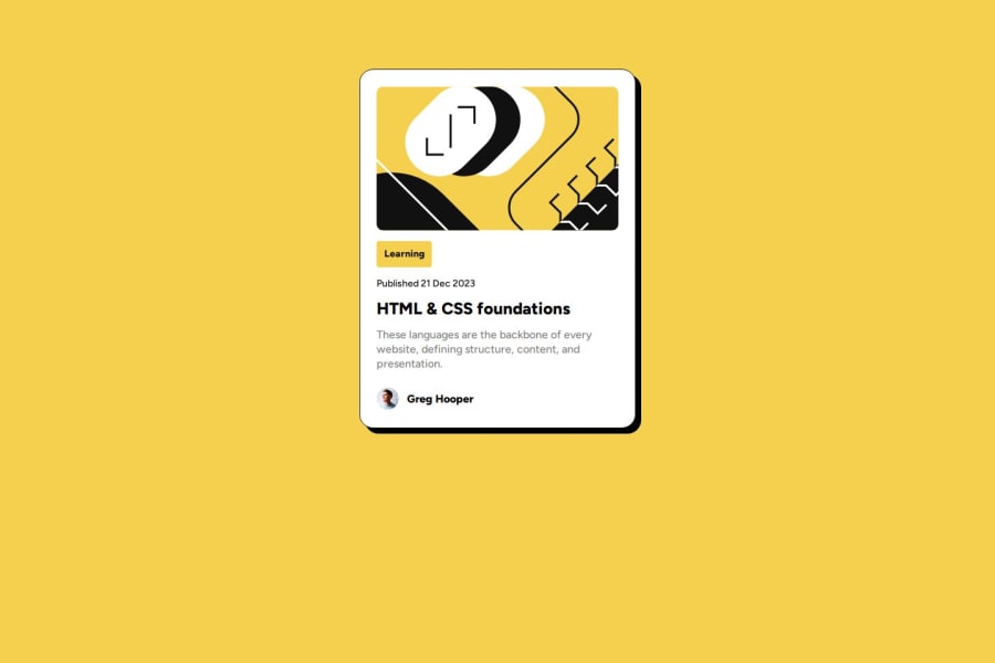
Design comparison
Solution retrospective
I'm proud to have started from 0 a short time ago and realized that I'm improving every day.
What challenges did you encounter, and how did you overcome them?is always being a challenge to make a responsive layout
What specific areas of your project would you like help with?Needing to learn more about responsive using grid
Community feedback
- @grifanoPosted 8 months ago
Hi π congratulations on your great job π The code is very pleasant to read, components look good for each screen size.
I have only suggested using jpg for exporting images like photos. You use SVG format for user avatars, and this format isnβt recommended for photos. It may not be obvious for this particular example, as you have a small image, however, if you export photos that will have a bigger size in SVG you get a huge image, which is not good for website performance.
More practice with responsive layout makes you stronger in this field. I see you use min-width, which is great for your understanding of the Mobile First approach and this is great.
You on the right path, this is a great job and keep going πͺ
0 - @dolapobjPosted 8 months ago
Really great work. Reviewing your code and comparing it to my solution I learned two things.
One is to use the <span> HTML element for decorating a piece of text inline, and also using media queries to specific styles to elements on the page when the viewport width is a certain width. I didn't do this for my solution and will begin using them from here on out.
I don't really have any suggestions other than to perhaps consider using SASS/SCSS to build CSS files. I've been using it because it allows you to define global variables that will then be used in the rest of your CSS file.
0
Please log in to post a comment
Log in with GitHubJoin our Discord community
Join thousands of Frontend Mentor community members taking the challenges, sharing resources, helping each other, and chatting about all things front-end!
Join our Discord