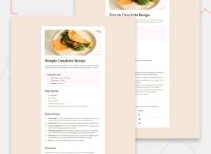
Design comparison
Community feedback
- @catreedlePosted 4 months ago
It might be helpful to extract your color variable like this :root { --white: hsl(0, 0%, 100%); } for reusable and readability. Your container looks to wide compared to the design. Setting the width to 55% makes it more similar in my case. Then you can set the width bigger for mobile with media query. Other than that it's really neat. You've done a great job!
Marked as helpful0 - @codesByJosePosted 4 months ago
yes it doesnt include semantic its accessible and im open to suggestions to improve the code yes the layout does look good on all screen sizes it is well structured, readable and re-usable yes it does differ considerable or a lot from the actual design as i tried to do something differently to achieve almost the same result
0
Please log in to post a comment
Log in with GitHubJoin our Discord community
Join thousands of Frontend Mentor community members taking the challenges, sharing resources, helping each other, and chatting about all things front-end!
Join our Discord
