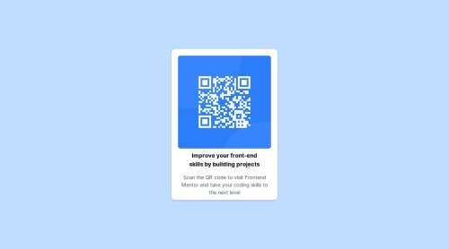
Submitted over 1 year agoA solution to the QR code component challenge
Responsive landing page
next, tailwind-css, react
@Santiago-Parra22

Solution retrospective
What are you most proud of, and what would you do differently next time?
I am proud of everything I learned from doing this first challenge. I feel that I have acquired too much knowledge, that it would be better to focus on finding an optimal solution and let myself be guided by those who have more knowledge.
What challenges did you encounter, and how did you overcome them?The challenge of placing the image within the same container as the letters will be overcome after several hours of research.
What specific areas of your project would you like help with?At the moment I feel that I am not that bad in knowledge, but any help will be well received.
Code
Loading...
Please log in to post a comment
Log in with GitHubCommunity feedback
No feedback yet. Be the first to give feedback on Santiago-Parra22's solution.
Join our Discord community
Join thousands of Frontend Mentor community members taking the challenges, sharing resources, helping each other, and chatting about all things front-end!
Join our Discord