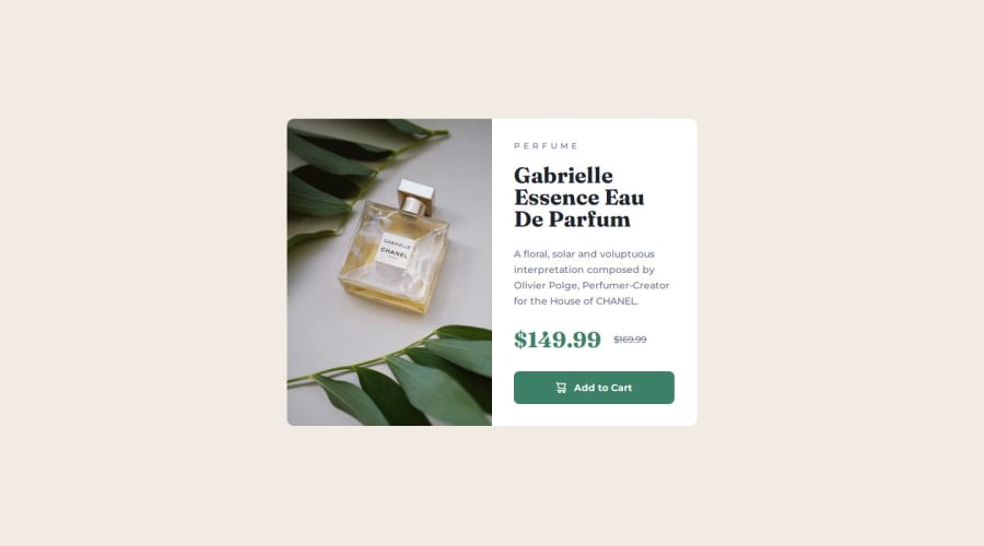
Design comparison
Community feedback
- P@biwwabongPosted 7 months ago
The design is spot on! However, one suggestion is to use semantic tags in your HTML for better structure and accessibility.
Also, there’s some redundancy in the button markup:
html Copy code
<div class="product-buy"> <button> <img src="images/icon-cart.svg" alt="icon cart white"> <p>Add to Cart</p> </button> </div> In this case, providing an alt text for the cart icon is unnecessary and can confuse screen readers. Since the button already says "Add to Cart," that’s all a screen reader user needs to hear. As it stands, a screen reader might announce: “icon cart white, Add to Cart,” which can be confusing.To resolve this, either leave the alt attribute empty (alt=""), or better yet, use aria-hidden="true" to completely hide the icon from screen readers. This way, the screen reader will focus on the "Add to Cart" text only.
Here’s an example of how you can improve this:
html Copy code <button class="product-text-add-to-cart"> <img src="./images/icon-cart.svg" alt="" aria-hidden="true" /> <span>Add to Cart</span> </button> This approach ensures a better and more coherent experience for screen reader users.
Great job all in all! I hope these pointers help :)
0
Please log in to post a comment
Log in with GitHubJoin our Discord community
Join thousands of Frontend Mentor community members taking the challenges, sharing resources, helping each other, and chatting about all things front-end!
Join our Discord
