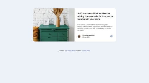
Submitted about 1 year agoA solution to the Article preview component challenge
Responsive landing page
@jonathanudeh

Solution retrospective
What are you most proud of, and what would you do differently next time?
I am proud of how responsive I made the page
What challenges did you encounter, and how did you overcome them?Displaying the soicals in deifferent pattern for both the mobile and desktop view. But I solved that with JavaScript
What specific areas of your project would you like help with?The only thing I was unable to replicate and need help with was making the share svg to be surrounded with grey color. I set the border but that made the svg smaller. I couldn't decipher how to achieve this without the size of the share svg being affected. Any help wil be higly appreciated. Point me in the right direction if you can. Thank you.
Code
Loading...
Please log in to post a comment
Log in with GitHubCommunity feedback
No feedback yet. Be the first to give feedback on jonathanudeh's solution.
Join our Discord community
Join thousands of Frontend Mentor community members taking the challenges, sharing resources, helping each other, and chatting about all things front-end!
Join our Discord