Submitted 10 months ago
responsive landing of recipe page usinghtml and css

@Jeissoncar97

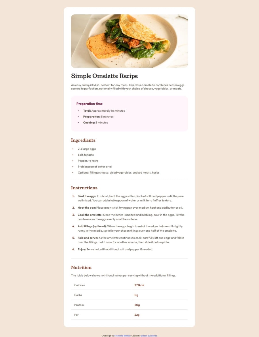
Design comparison
SolutionDesign

Solution retrospective
What are you most proud of, and what would you do differently next time?
I am proud that I finished it in 4 hours and it looked very similar, the organization of the html would be improved.
What challenges did you encounter, and how did you overcome them?The most difficult were the list markers, thanks to several forums I did it in a very comfortable wa
Community feedback
- @vitchetPosted 10 months ago
Hello, Jeisson!
Very nice work, looks very close to design!
But there are a few moments I want to mention:
- If you take a closer look to the mobile design you could notice that it's a little bit different from the one for desktop. In the mobile version there is no padding around the component, also there is no padding around the image. Your padding seems static, so the whole component is shrinking on mobile but the padding doesnt and it looks relatively bigger.
- Try using flex-box, it makes code cleaner and easier to maintain. It's really easy to get lost in all the margins and paddings. It may seem scary to use that technique, to be honest, I hesitated to use it myself, but this little game helps a lot. Try it out: https://flexboxfroggy.com
- In the nutrition table there is no line after the last line, using ":nth-child" pseudo-selector can help fix it.
- In ingredients section the markers are squares not disks. Yes, markers bring pain, but I believe after all the work you've done, you will easily deal with that problem.
- As you mentioned your self the html needs improvement. Semantic html is mandatory
now days.
Hope I didn't overwhelm you with all those notes. They are actually small, but can help you improve. For the rest, you did really great job, at the moment it's the best solution I've seen on the site.
Keep going!
Marked as helpful1

Please log in to post a comment
Log in with GitHub
Join our Discord community
Join thousands of Frontend Mentor community members taking the challenges, sharing resources, helping each other, and chatting about all things front-end!
Join our Discord